Foundation Unit
Due to COVID-19, edits and refinements to this introductory unit cannot be made.
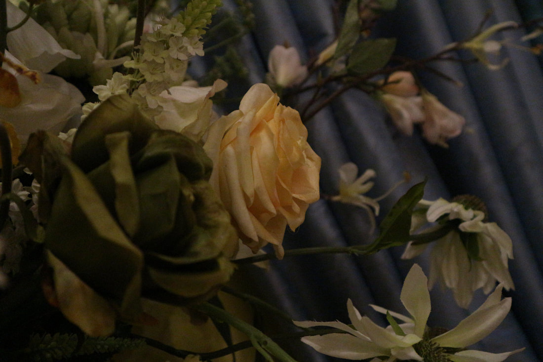
Summer Homework: Photo Diary
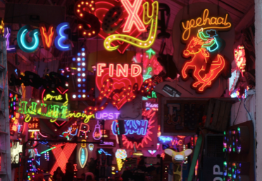
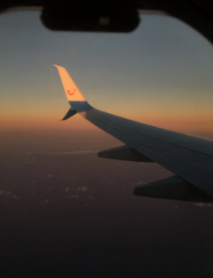
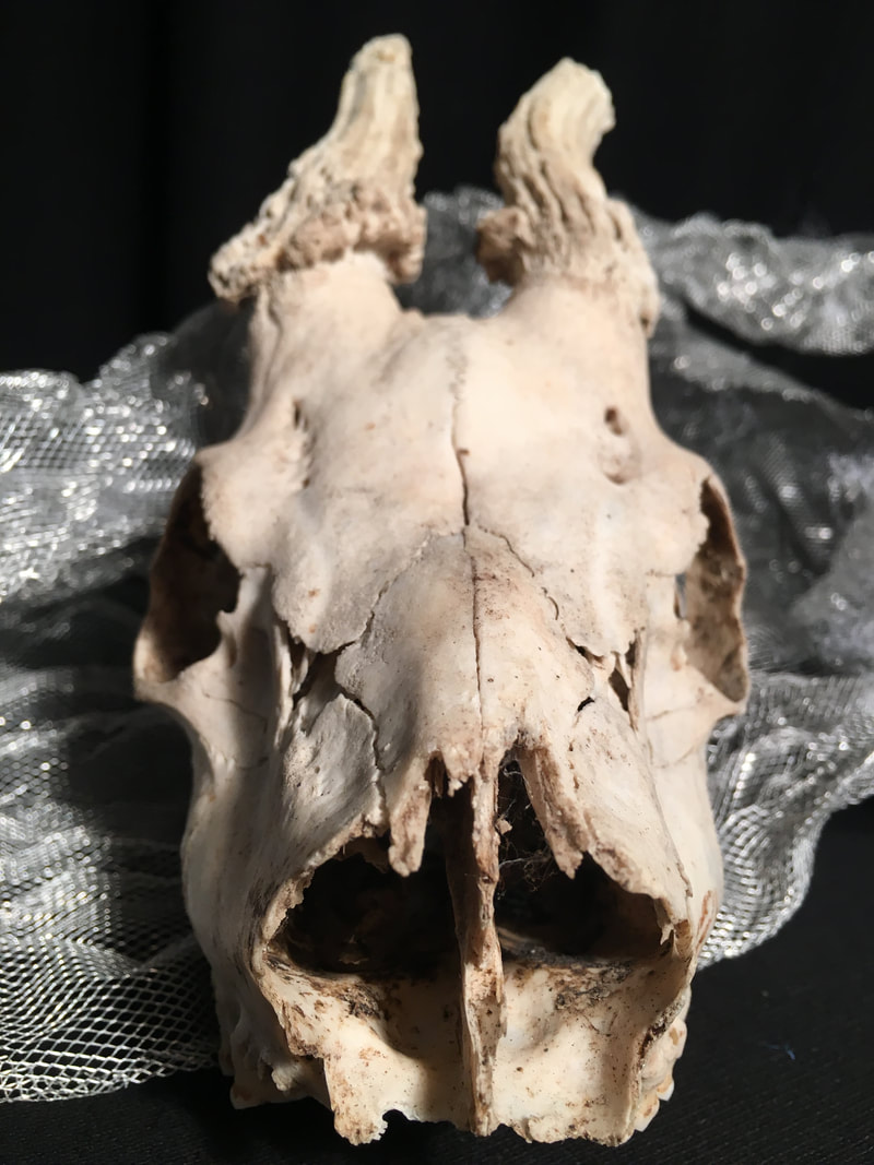
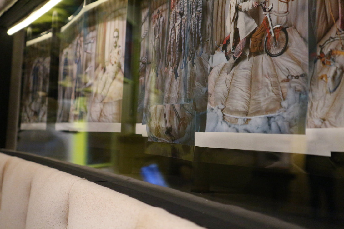
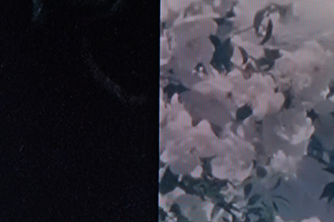
The following photos show how I spent my summer leading up to my a-level studies. I took the photos on my camera and also my phone. Firstly, they show my time in London, at home, which is set at my house, my friends or in central. One of my favourite parts of this is when I went to ‘Gods Own Junkyard’, taken on my camera. The reasons these are my favourite are because of the vibrant lights and how they are colourful and further creates contrast between the white wall against the inside o the building with the lights Inside. After my time at home I went to Nice with my friend. Many of my photos taken there include the sunset and the beach because I really like the silhouettes of the palm trees against the sunset on the beachfront. Near the end of summer I travelled to Gran Canaria, which I document with a photo of the flight to and back. One of the main reasons this stuck out to me is due to the fact that they are very similar but still different. Another thing that I admire of the photos I took there is a picture I took in a local town, contrast is created between the blue sky and colorful flowers against the white buildings. Finally, I went to Cornwall with my family. During my time there we visited a local gallery, which had an artificial plant grower by Nick Laessing, this stood out to me due to the synthetic light reflecting against the unnatural leaves of the plants. The plant constantly moves around with water and light making it grow twice as fast as a normal crop; again showing the fakeness of it.


|


|


|


|


Gallery Visits
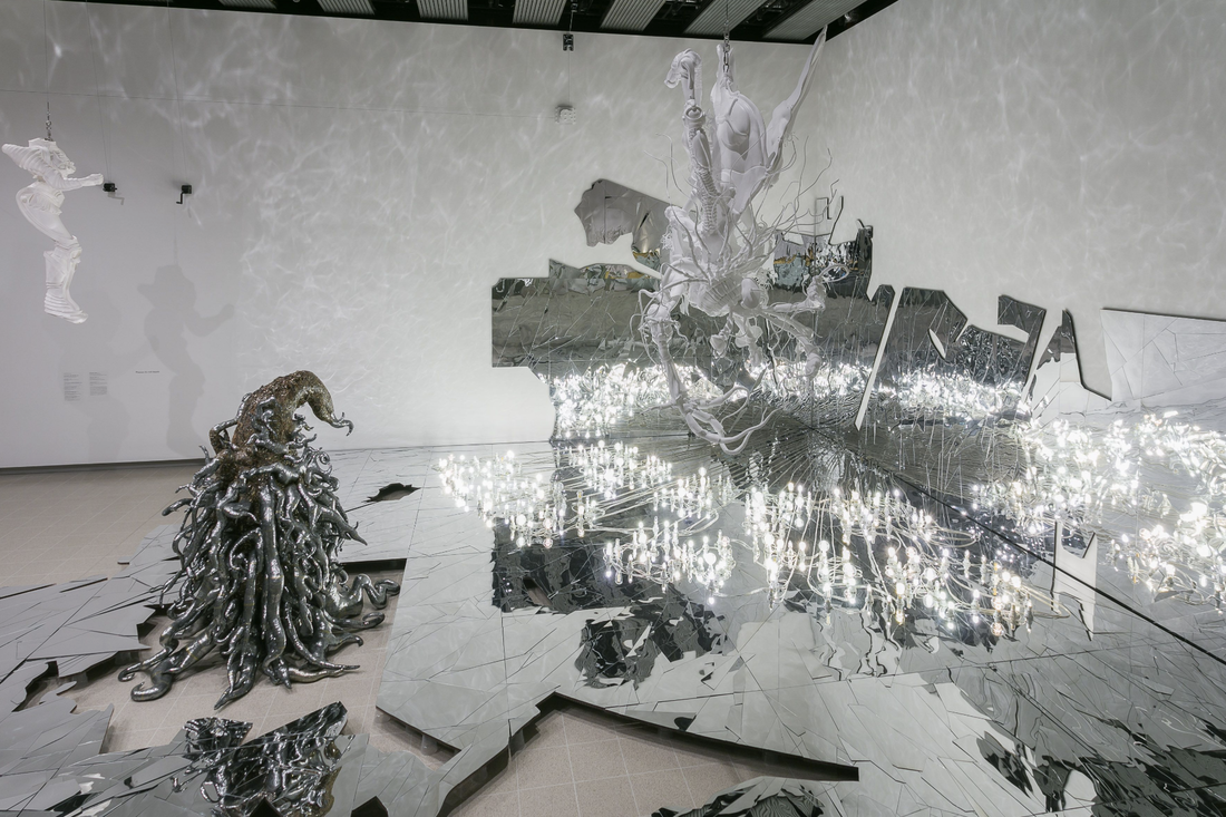
Newlyn Art Gallery: Nick Laessing

|

|

|
" Laessing's work engages with the idea of the 'Anthropocene'"
The main objective of this piece is to offer functional solutions for surviving in sustainable ways such as growing food in simulated zero-g. I like the effect of the synthetic light against the unnatural leaves of the plants. The plant constantly moves around with water and lights making it grow twice as fast as a normal crop, the light represents the fakeness of this. Much of Laessing's work plays with the idea of light and is frequently shown throughout his work as a central part. This is especially shown in his piece (on the left), as the light is the central element creating attention to it immediately. |
|
Another piece of Laessing’s work that stood out to me (that wasn't in the gallery) was his exhibition in Reading called light. Here he explores themes such as 'free-energy' by producing a new body of work based around experiments with the machine prototype II. Scientist Nikola Tesla who thought it was possible to harvest free energy from the atmosphere also inspired Laessing. The piece is a reconstruction of a radiant energiser in an attempt to be the source of power for lighting and sound equipment. This stood out to me due to the copper colour of it and the glass features surrounding it with a light above it creating a spotlight.
"Nick Laessing’s work revisits the utopian aspirations of scientific rebels, autodidacts and amateur experimenters." |

|

|
The Exchange: Peggy Atherton

|

|

|
Another exhibition that I liked was one by Peggy Atherton who collects road kill and slip-casts it to make ceramic shells that show the spaces where an animal or bird used to be. I found this very interesting as she keeps the cremated parts of the animal inside the shell of the creature; this makes it seem like a urn for the dead. Atherton even does this for insects such as flies, which is a very delicate job. This was represented by how it was shown throughout the gallery in places such as windowsills and on the floor. This stood out to me because of its sense of loss and absence presence, this is due to how the sculptures are slip casts and therefore represent the animal that used to live in it before. To emphasis this Atherton also keeps the cremated ashes of the creature inside the slip cast again showing the theme of absence presence.
Photographers Gallery: Raúl Cañibano

|

|

|
Cañibano's exhibition, chronicles of an island show his work from Cuba showing life in the city and the countryside. His work focuses on the country's people and lives in a post revolution era and therefore shows his love for his homeland. I picked this gallery to go visit not only because of how popular it was but also because of Cañibano's ability to tell stories through his photos. Many of the images are taken at mid points as they move, for example in the one above it is taken just before that axe is swung downward. Furthermore the photos include disruptive and weird elements which is shown in a photo where a pair of tiny hands are clasped behind a woman's neck, this is made to look like they are hers which create and intriguing effect. His work stood out to me because there is no colour, all of it is monochrome. This creates shadows within the images and creates more depth to it therefore creating attention to it.
"Raul Canibano is the one of the finest of the current generation of Cuban photographers. He captures the essence of Cuban society like no one else."

|
One of my favourite images of Canibano is this one. The photo includes a woman with tiny hand clasped behind a woman's neck as if they were hers. The effect of the monochrome photo creates depth into the photo and could represent the dark struggles Cuba has had in previous years. However it’s likely that Canibano was just using a black and white camera at the time. The image raises questions as the woman has rollers in her hair at the beach, an unusual thing to do. Furthermore his work had disruptive and weird perspectives, this being one of them; this creates both an intriguing and unsettling effect on the viewer. The angle that this photo is taken is peculiar with the beach on equal sides next to her with people in front of it. This further creates an intriguing effect for the viewer.
|
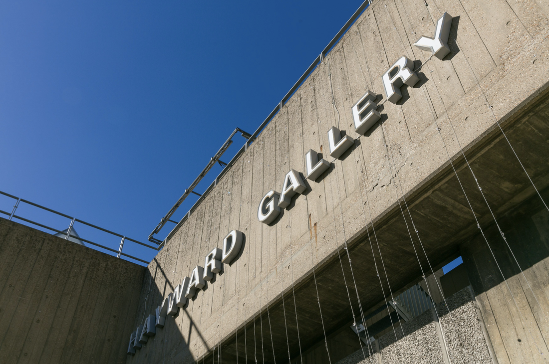
Lee Bul @ the Hayward Gallery
"Through the subtlety and the intensity of the works Lee Bul brings together things which do not work together, like beauty and horror"
|

|
|
|
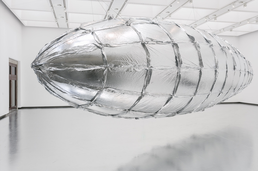
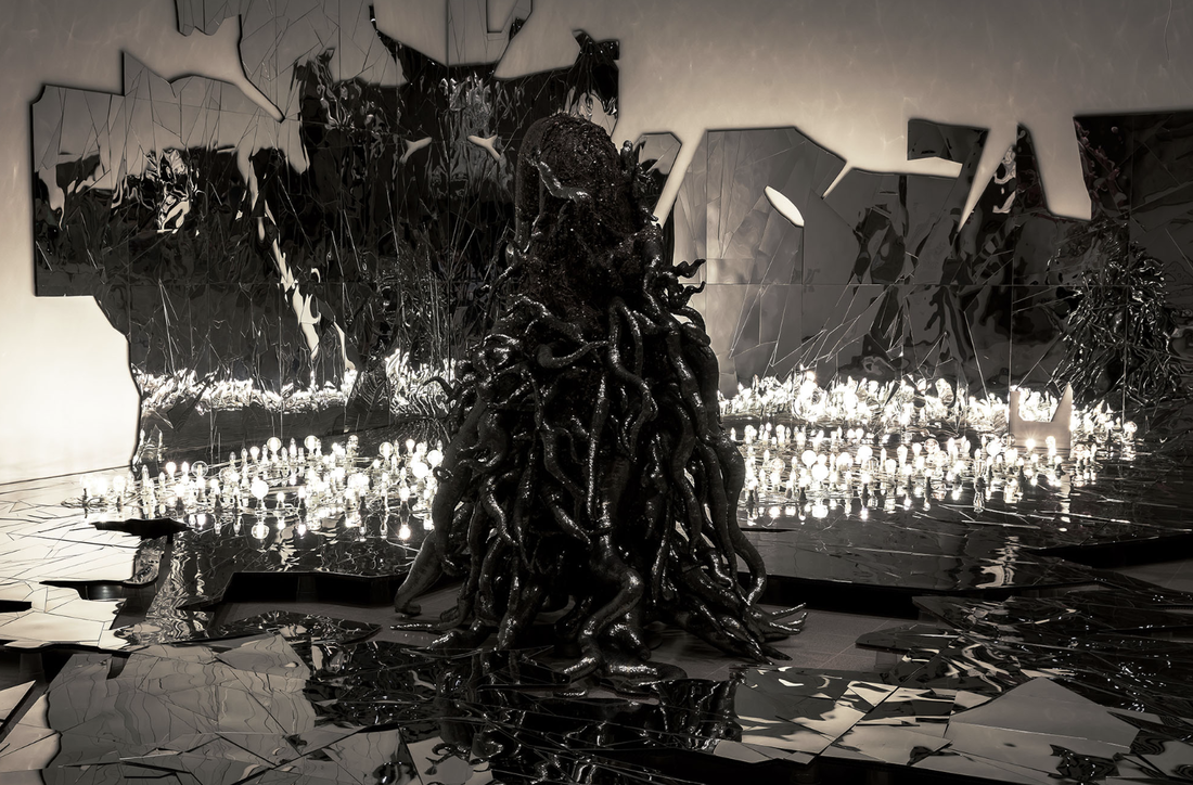
I visited Lee Bul's independent show in the Hayward gallery in preparation for my a-level studies in photography. The reason I chose this gallery was because of how Bul deliberately clashes materials in order to create a dramatic effect. Her work is also very different to most artists; her exhibition is called ' beauty and horror' which again refers to how she clashes materials. Furthermore her inspirations include science fiction, visionary architecture (the Hayward gallery) and personal experience; all of her work represents this in my opinion. The visit taught me that even if a material doesn't match with another it doesn't mean that it won’t work. Bul's materials range from silk and mother of pearl to fibreglass and silicone, furthermore, this doesn't just apply with materials but also the position of the sculptures and the colour of them. Also her work has inspired to recreate some of her work in future pictures, as the topics that inspire her are very appealing to me. As she transforms the gallery into a "spectacular dream-like landscape featuring monstrous bodies, futuristic cyborgs, glittering mirrored environments and an exquisitely surreal monumental foil Zeppelin". Bul throughout the exhibition attempts to get out body and our brain 'working at the same time together' through large-scale pieces in the gallery, she also uses space with this. By hanging objects on the celling and making the majority of ones on the ground tall it immediately creates attention towards it.

|
|

|
|
"It's hard to think of a more appropriate setting for the work of the Korean artist Lee Bul"

One of my favourite pieces in the exhibition is this piece because of its dramatic height and objects collected together to make the sculpture. One if the things that struck out to me is the part of all the bodies/ body parts that are collected together to make the piece, this presents the idea of the outside vs the inside as its the inside of the body. Furthermore, the position that the bodies are all in is uncomfortable which could represent Lee Bul's past of growing up in South Korea. Bul spent most of her childhood fleeing persecution and moving between temporary houses because her parents where on the ' left side' so this could represent her struggle in a dictatorship. The colour also stood out to me as its quite soft and attracts attention, as most of her work is monochrome. Also, the colour is similar to 'baker miller pink' which is scientifically know to reduce hostile, violent and aggressive behaviour. This again creates contrast as the sculpture itself is put together aggressively in an uncomfortable position, however the colour is meant to calming properties. This further shows Bul's tendency to clash materials with the position of it and the colour itself.
Lee Bul
Biography:
Lee Bul was born in South Korea in 1964 and spent most of her childhood fleeing persecution and moving between homes, as her parents where leftist parents (against the authoritarian government then in power). As a result she regularly felt like an outsider in the new places she lived however she found relief in drawing and making. Bul enrolled at Hongik University ( Seoul) in 1984 to study sculpture. She then developed an interest in theatre which lead to her to perform her fist public performance in 1988 and continued to create work involving her own body. More then 10 years later in 1998 she was chosen to be a finalist for the Hugo Boss prize where she presented her 'cyborg' series. A year later she became the first woman to represent Korea at the Venice Biennale. Bul's inspirations include science fiction, visionary architecture and personal experience and also using deliberately clashing materials that range from silk and mother of pearl to fibreglass and silicone. Most recently Bul's work is in the Hayward gallery tuning it into a "monstrous bodies, futuristic cyborgs, glittering mirrored environments and an exquisitely surreal monumental foil Zeppelin."
Lee Bul was born in South Korea in 1964 and spent most of her childhood fleeing persecution and moving between homes, as her parents where leftist parents (against the authoritarian government then in power). As a result she regularly felt like an outsider in the new places she lived however she found relief in drawing and making. Bul enrolled at Hongik University ( Seoul) in 1984 to study sculpture. She then developed an interest in theatre which lead to her to perform her fist public performance in 1988 and continued to create work involving her own body. More then 10 years later in 1998 she was chosen to be a finalist for the Hugo Boss prize where she presented her 'cyborg' series. A year later she became the first woman to represent Korea at the Venice Biennale. Bul's inspirations include science fiction, visionary architecture and personal experience and also using deliberately clashing materials that range from silk and mother of pearl to fibreglass and silicone. Most recently Bul's work is in the Hayward gallery tuning it into a "monstrous bodies, futuristic cyborgs, glittering mirrored environments and an exquisitely surreal monumental foil Zeppelin."
Recreating Bul's work
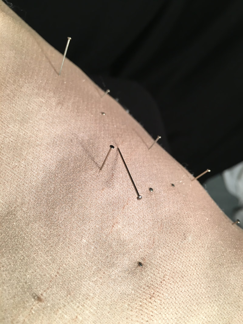
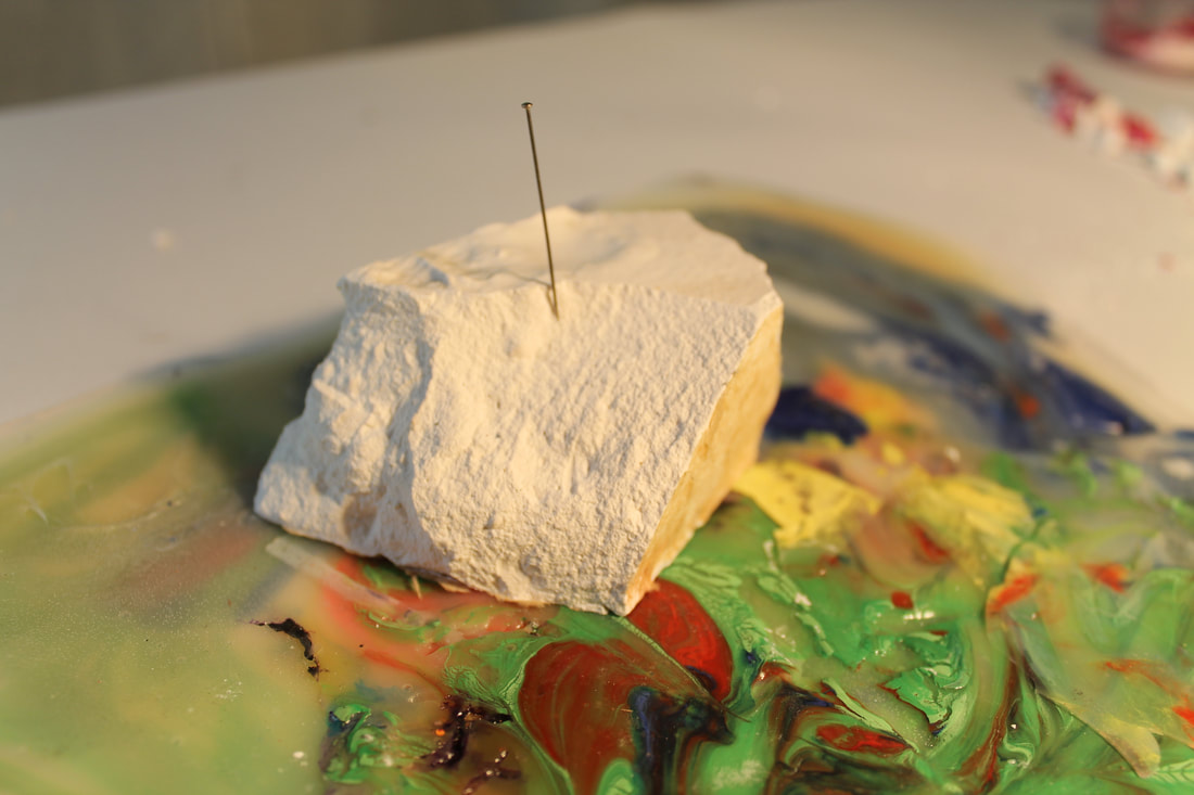
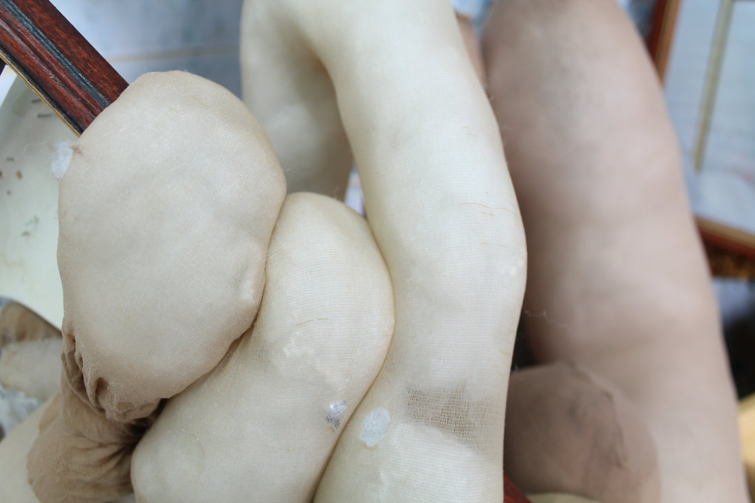
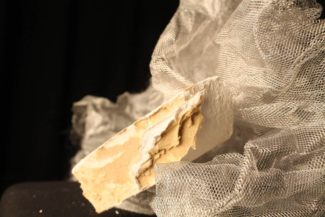
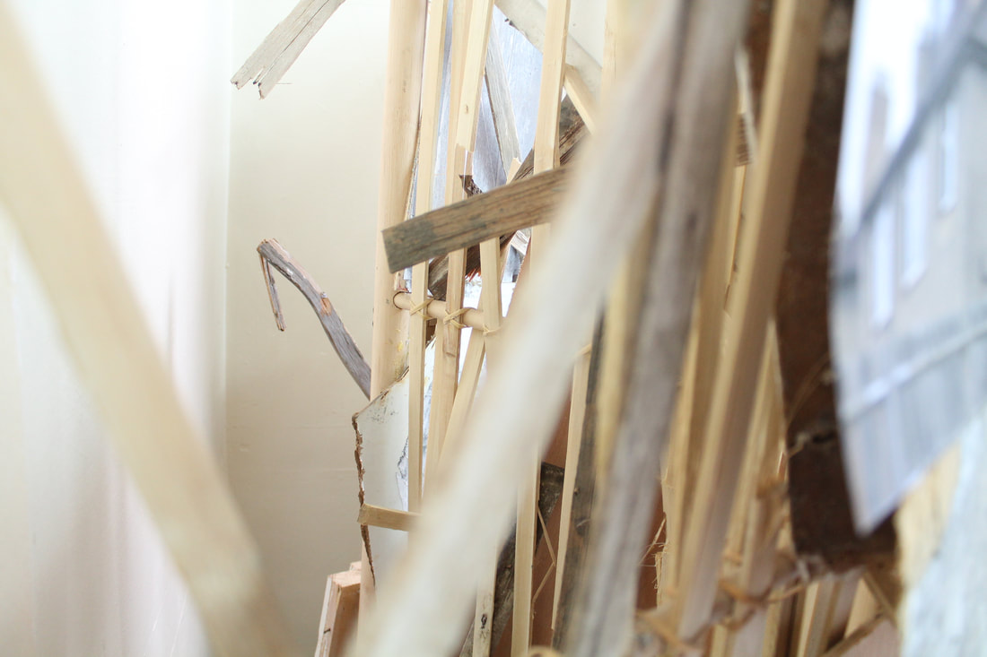
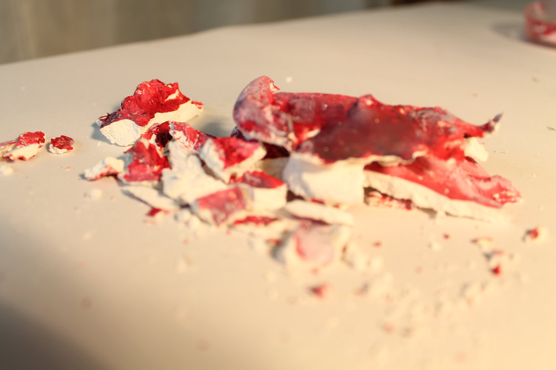
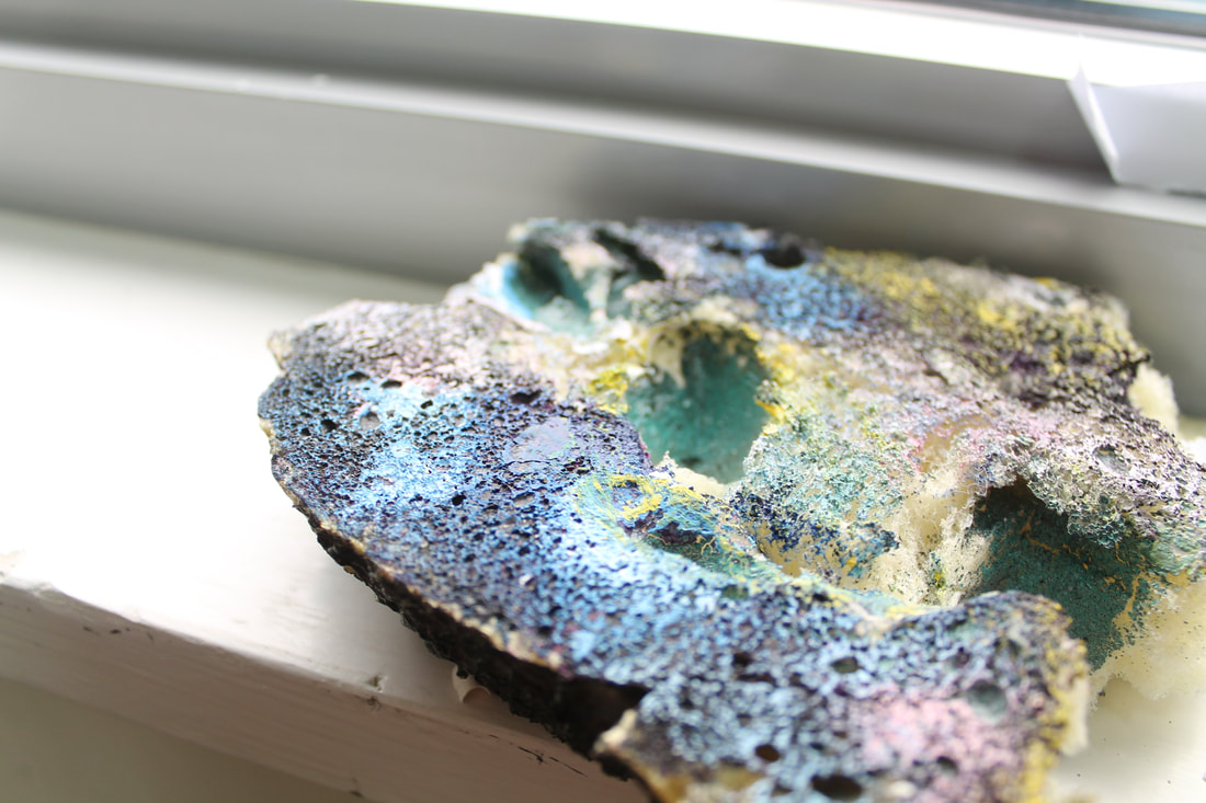
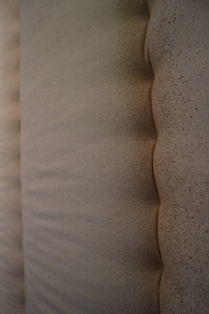
Theme 1: Macro
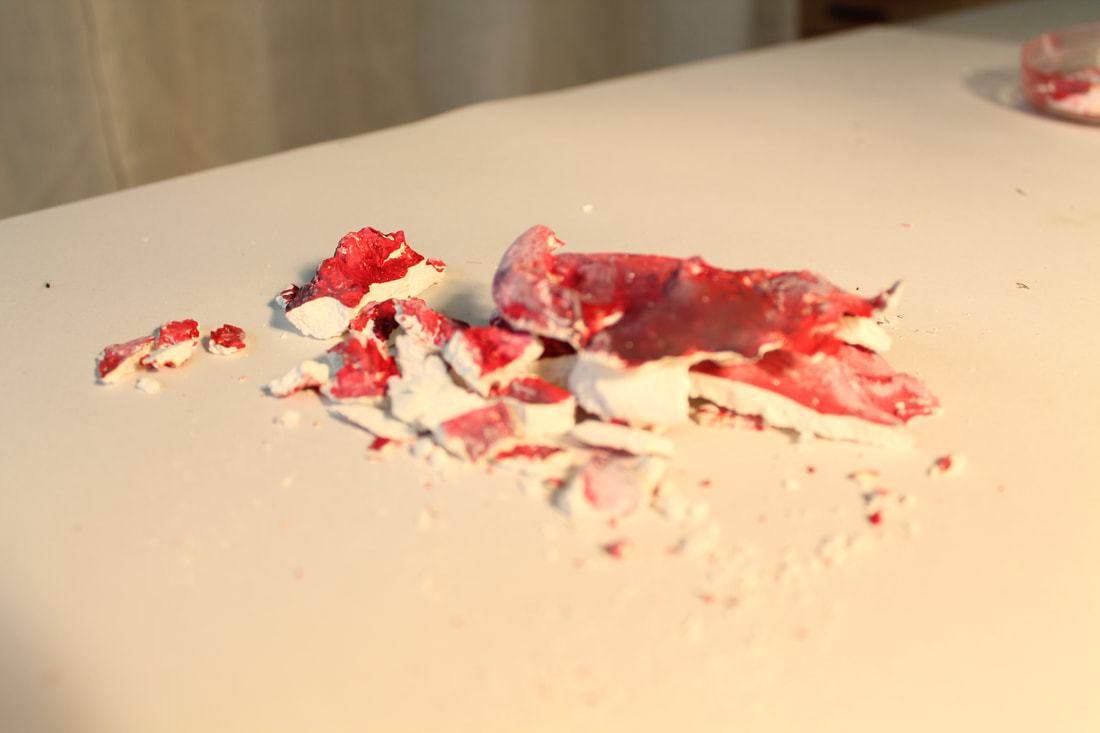
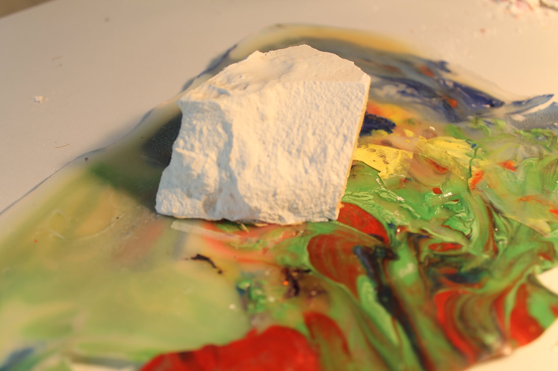
In these photos I attempted to take the pictures very close up to capture specific details that weren't visible from a distance, in order to emphasis this I also used different lighting techniques. In order to recreate Lee Bul's work I used unusual materials such as a stuffed light with pins through it, this creates contrast between a soft material and a harsh pin. Furthermore it also represents one of her themes through her work of beauty vs horror. Although that specific image isn’t specifically beautiful it creates the impression of a human arm, which then shows horror as the pins are sticking through it, again showing destruction and pain. To show this gain through my work I took a very close up image of a sponge with pain over it, this gain shows beauty as to how in detail it is however horror because the colours look a bit like mould, something unattractive. Furthermore to completely show the 'macro' effect I made sure to take the picture very close up in focus. One of the main examples of this is the photo of the sponge covered in paint, by using the macro effect I made sure each specific detail of how the paint has dried around it emphasises the effect. Especially because the background is blurred, creating attention toward the centre of the photo (the paint covered sponge). Again showing this is the photo of the wire, on of the main reasons I like this is due to the fact that only part of it is in focus with the rest of it blurred. This draws the viewer’s eye because it has the same continuous background, this also could show some of the formal elements: pattern and shape.
In these photos I attempted to take the pictures very close up to capture specific details that weren't visible from a distance, in order to emphasis this I also used different lighting techniques. In order to recreate Lee Bul's work I used unusual materials such as a stuffed light with pins through it, this creates contrast between a soft material and a harsh pin. Furthermore it also represents one of her themes through her work of beauty vs horror. Although that specific image isn’t specifically beautiful it creates the impression of a human arm, which then shows horror as the pins are sticking through it, again showing destruction and pain. To show this gain through my work I took a very close up image of a sponge with pain over it, this gain shows beauty as to how in detail it is however horror because the colours look a bit like mould, something unattractive. Furthermore to completely show the 'macro' effect I made sure to take the picture very close up in focus. One of the main examples of this is the photo of the sponge covered in paint, by using the macro effect I made sure each specific detail of how the paint has dried around it emphasises the effect. Especially because the background is blurred, creating attention toward the centre of the photo (the paint covered sponge). Again showing this is the photo of the wire, on of the main reasons I like this is due to the fact that only part of it is in focus with the rest of it blurred. This draws the viewer’s eye because it has the same continuous background, this also could show some of the formal elements: pattern and shape.

|

|

|

|

|
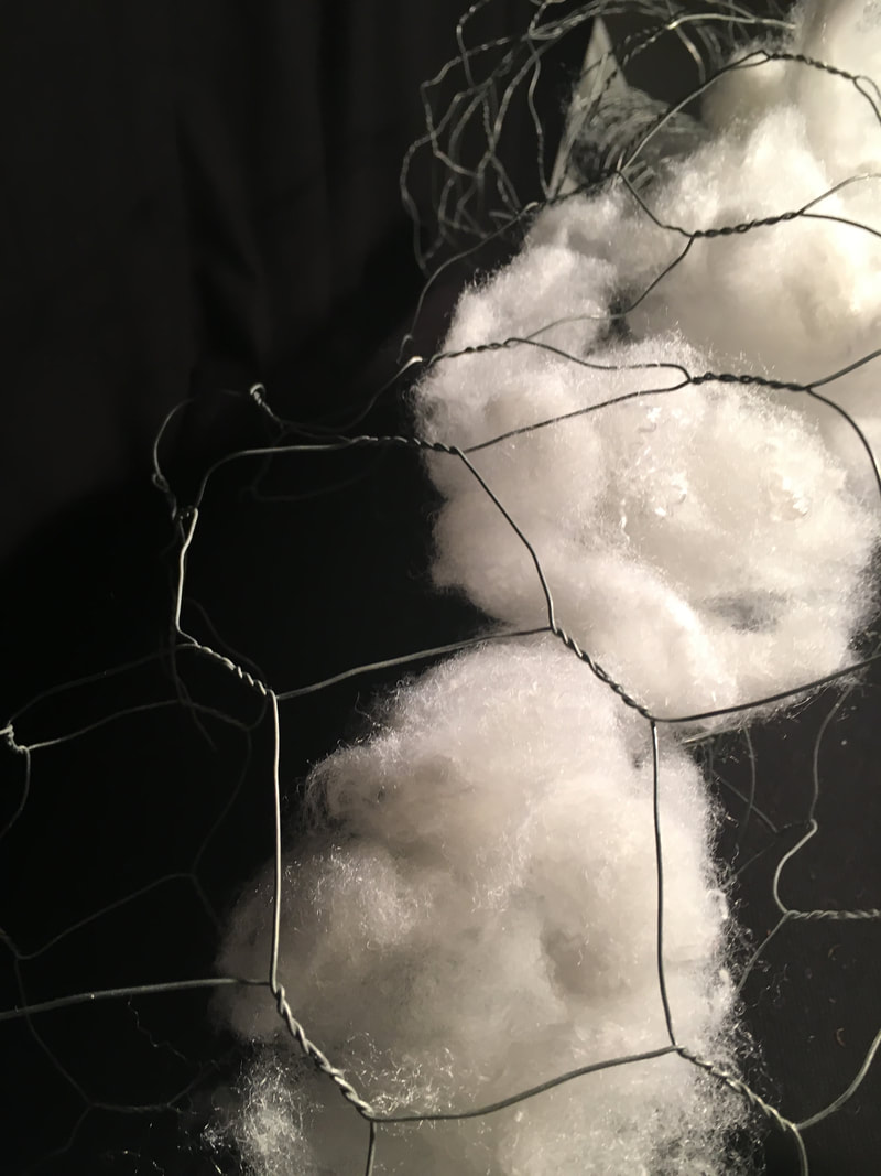
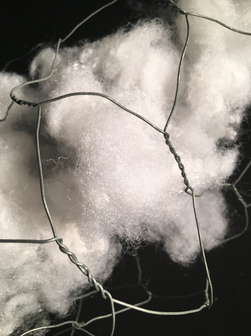
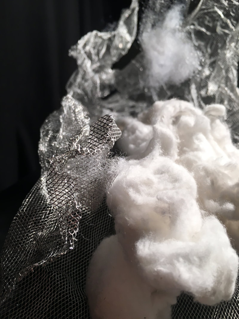
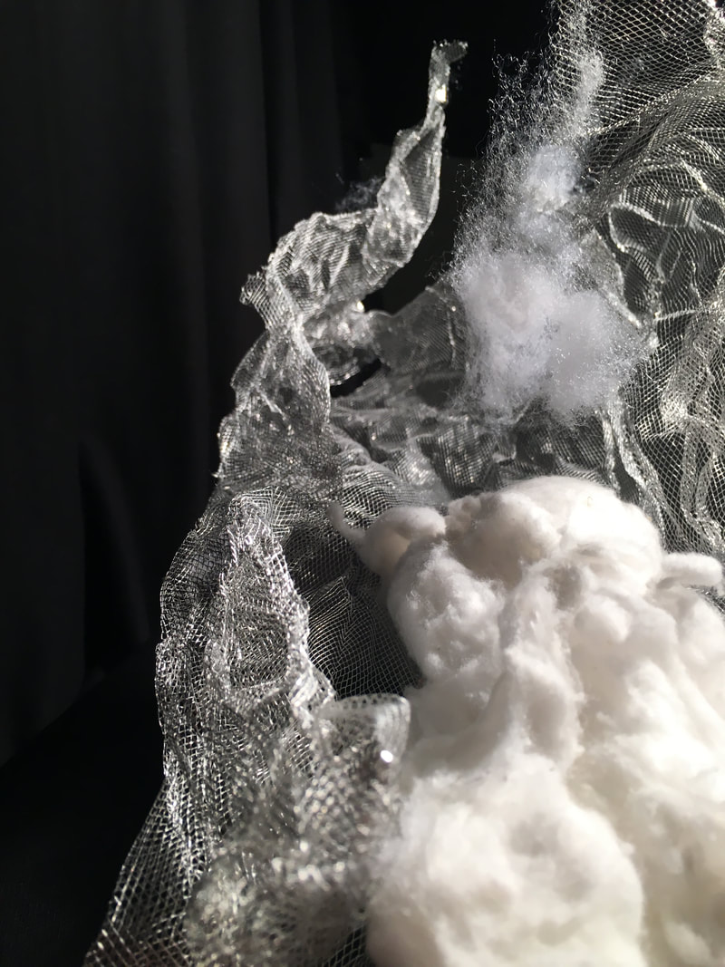
Theme 2: Contrast
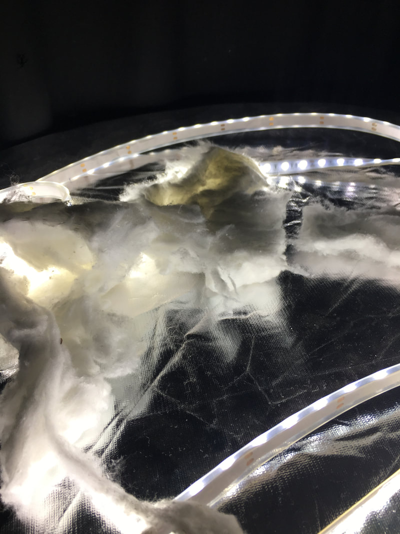
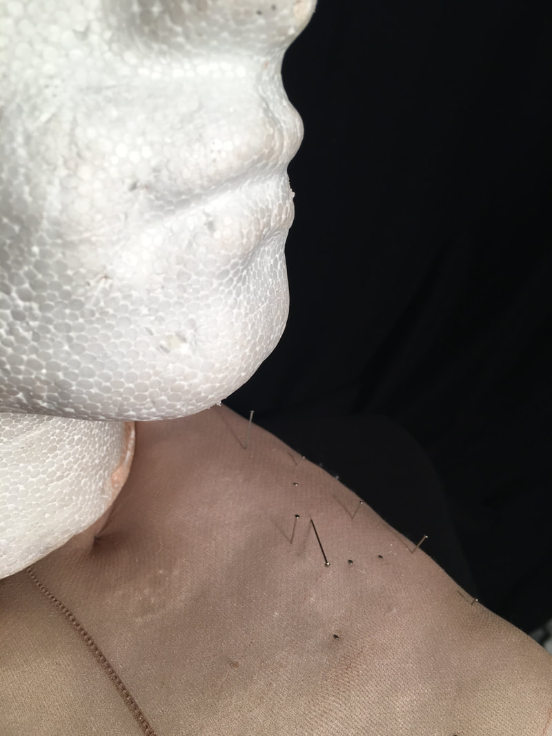
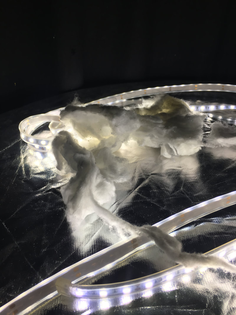
Lee Bul's work creates contrast by using deliberately clashing materials this emphasises certain things in her work and makes it the focus of the image. I showed this by using materials such as metal foil against cotton wool, both are very different as the metal is quite harsh and dramatic whereas as the cotton is soft therefore the opposite. One of the main examples of this is by using tights stuffed with cotton wool with pins sticking out of it. This also shows the theme of beauty vs horror. By experimenting with different apertures, it creates the effect of the front part being in the focus and the back not being in focus. Furthermore, this specific imagine stands out to me due to its black background creating a focus point on the pins which the aperture emphasises. When taking these photos, I made sure to use many different materials such as metal foil, dried paint and sponges, this is regularly shown in Bul's work. I also made sure to experiment with different lighting positions, this creates shadows in differently places and make things stand out.
Lee Bul's work creates contrast by using deliberately clashing materials this emphasises certain things in her work and makes it the focus of the image. I showed this by using materials such as metal foil against cotton wool, both are very different as the metal is quite harsh and dramatic whereas as the cotton is soft therefore the opposite. One of the main examples of this is by using tights stuffed with cotton wool with pins sticking out of it. This also shows the theme of beauty vs horror. By experimenting with different apertures, it creates the effect of the front part being in the focus and the back not being in focus. Furthermore, this specific imagine stands out to me due to its black background creating a focus point on the pins which the aperture emphasises. When taking these photos, I made sure to use many different materials such as metal foil, dried paint and sponges, this is regularly shown in Bul's work. I also made sure to experiment with different lighting positions, this creates shadows in differently places and make things stand out.

|

|

|

|

|
Theme 3: Shadows
When taking these photos, I deliberately used the studio equipment to create shadows with the directional light and diffused light. In order to create these effects I had to experiment with different lights and where they were placed. To get the second photo we had to make sure the light was at the right angle in order for the shadow to be visible. Furthermore, in order to get rid of shadows the object needs to be placed far away from the background, so to get the shadows I had to do the opposite of this. One of the best examples of shadows in these photos is the one of the chairs against the black background (second to the left), this is due to the shadow created from the chair. I deliberately placed the chair not in the centre so that the shadow was in the centre instead. By using shadows this creates a dramatic effect which intrigues the viewer when looking at the photos.
When taking these photos, I deliberately used the studio equipment to create shadows with the directional light and diffused light. In order to create these effects I had to experiment with different lights and where they were placed. To get the second photo we had to make sure the light was at the right angle in order for the shadow to be visible. Furthermore, in order to get rid of shadows the object needs to be placed far away from the background, so to get the shadows I had to do the opposite of this. One of the best examples of shadows in these photos is the one of the chairs against the black background (second to the left), this is due to the shadow created from the chair. I deliberately placed the chair not in the centre so that the shadow was in the centre instead. By using shadows this creates a dramatic effect which intrigues the viewer when looking at the photos.

|

|

|

|
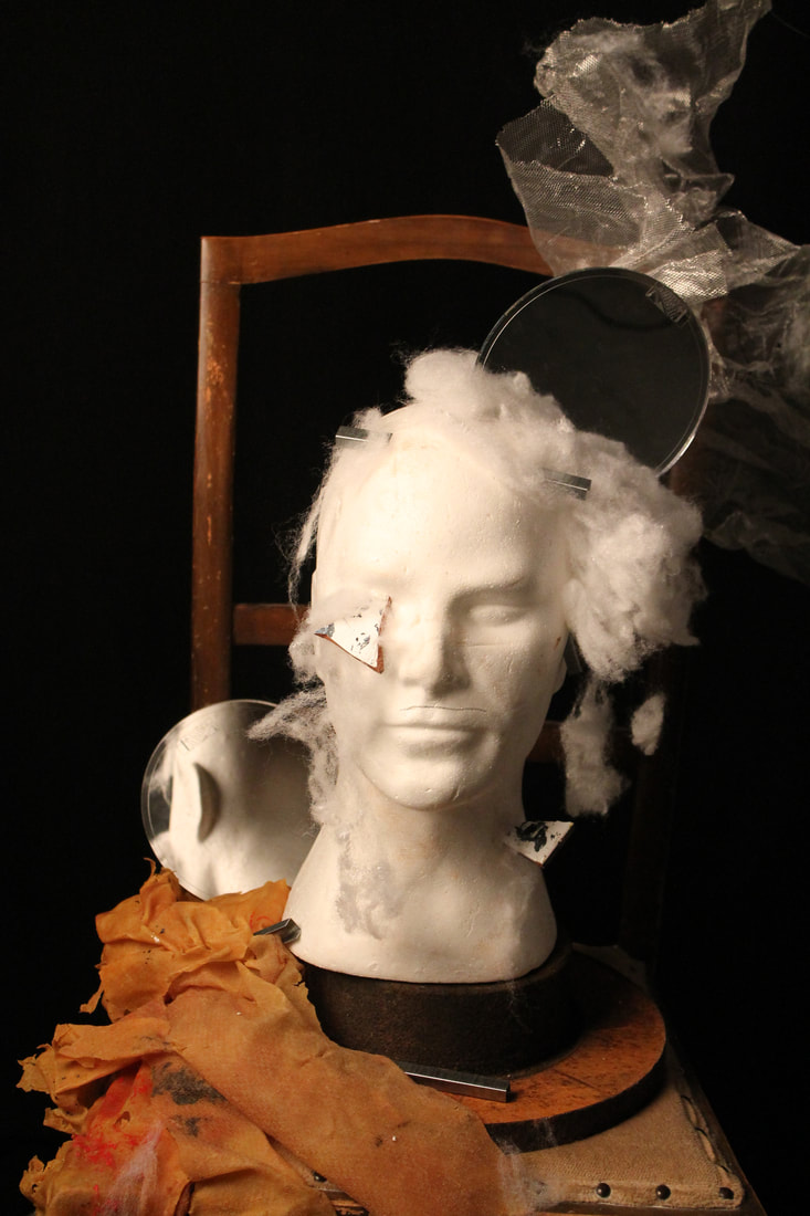
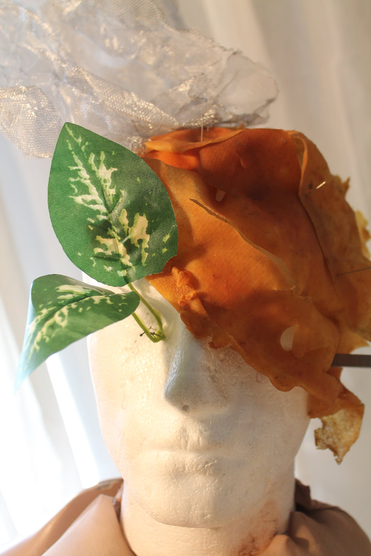
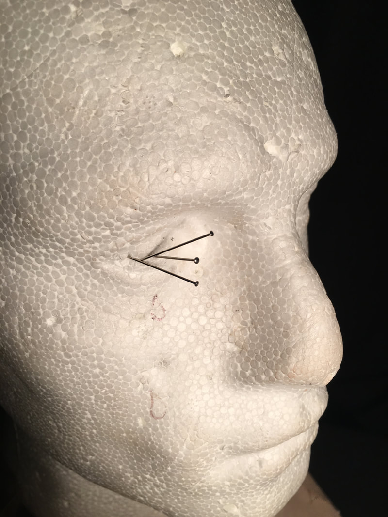
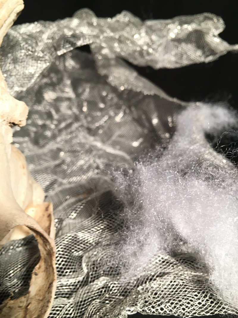
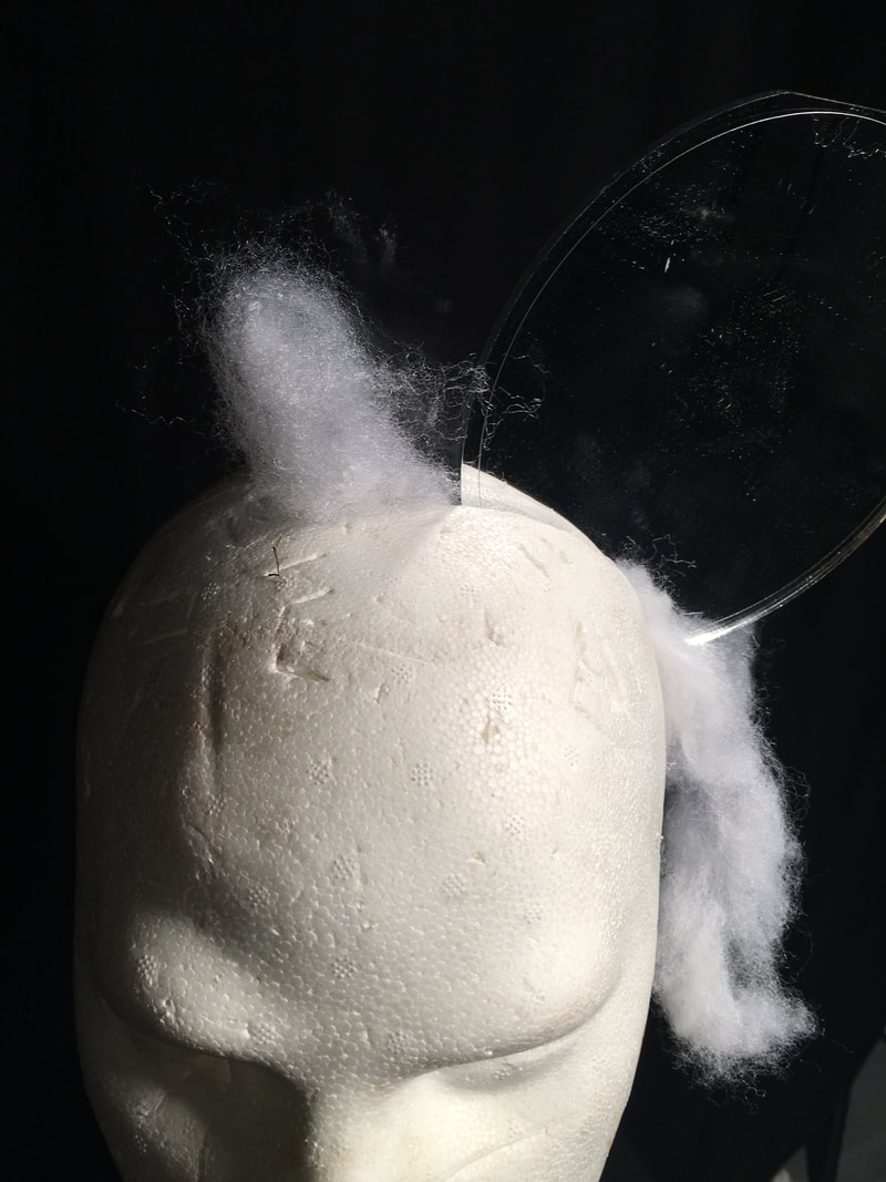
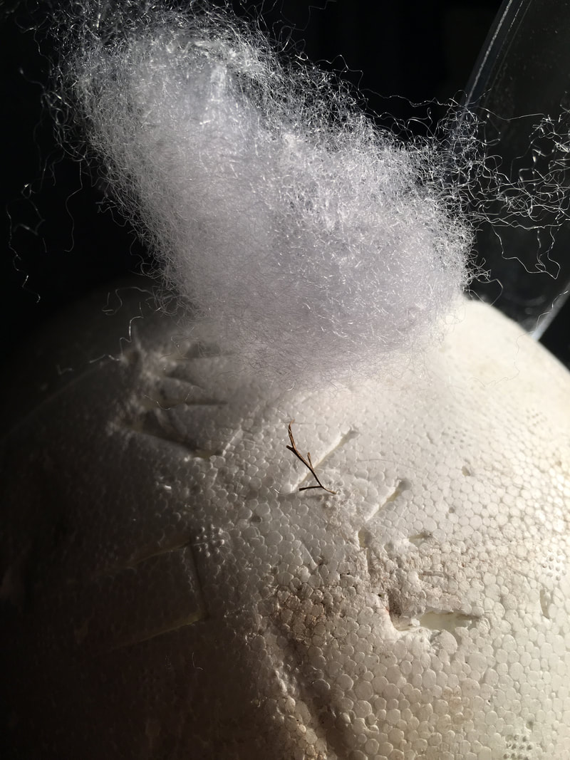
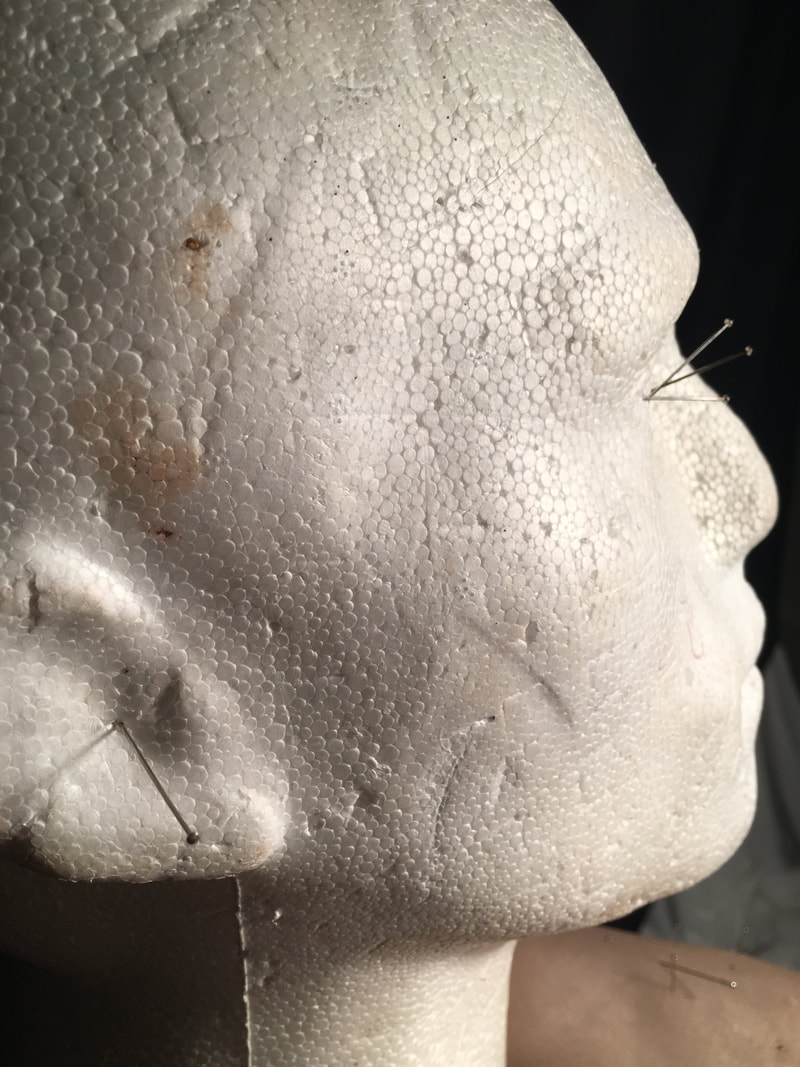
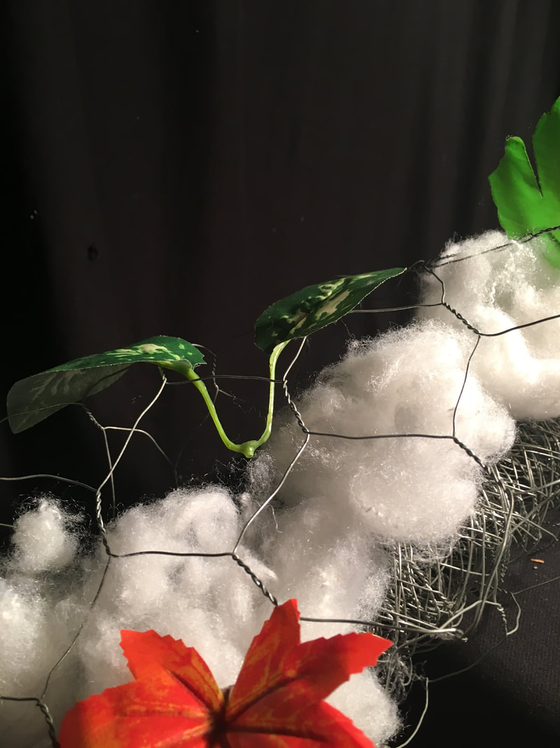
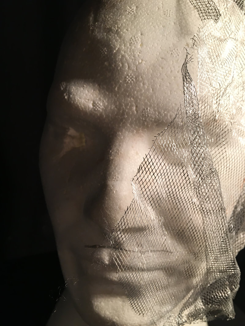
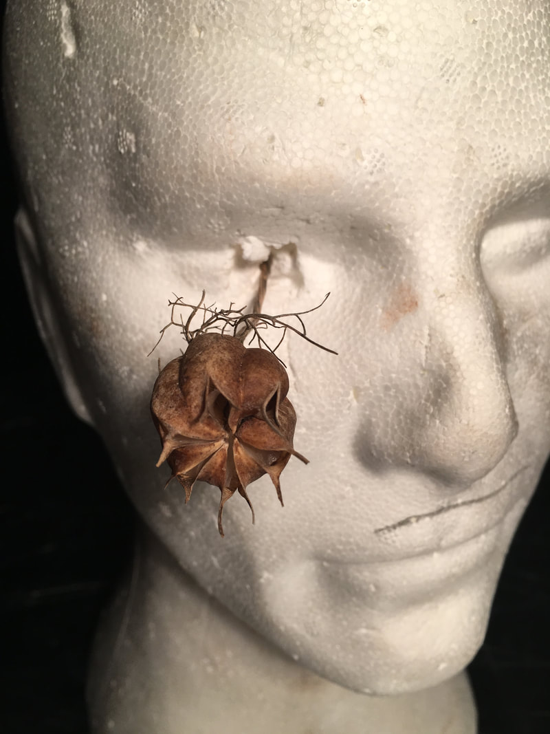
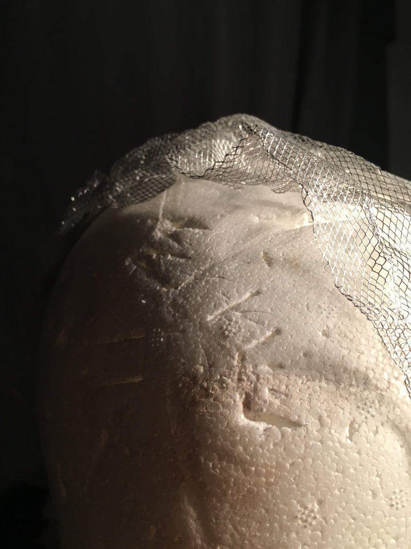
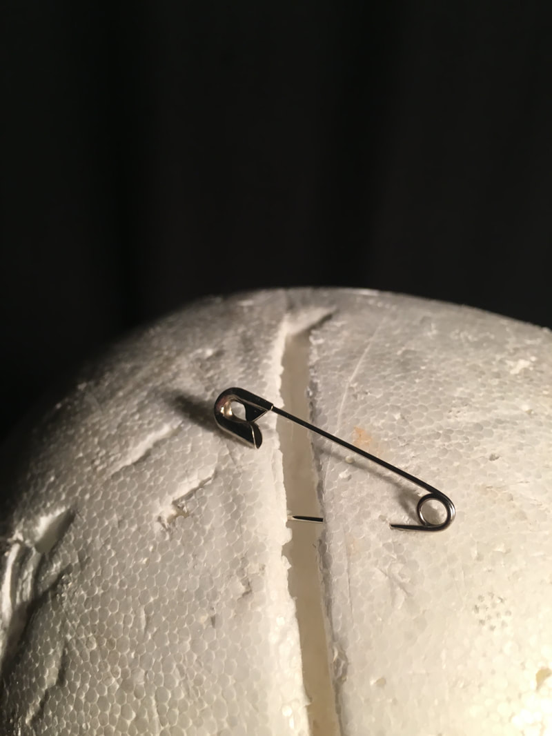
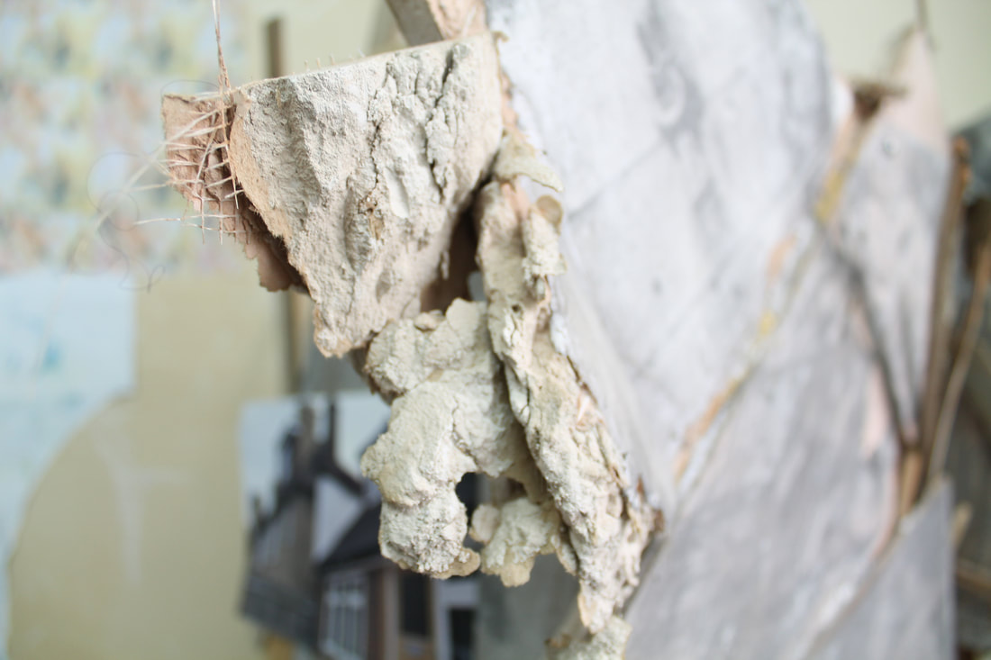
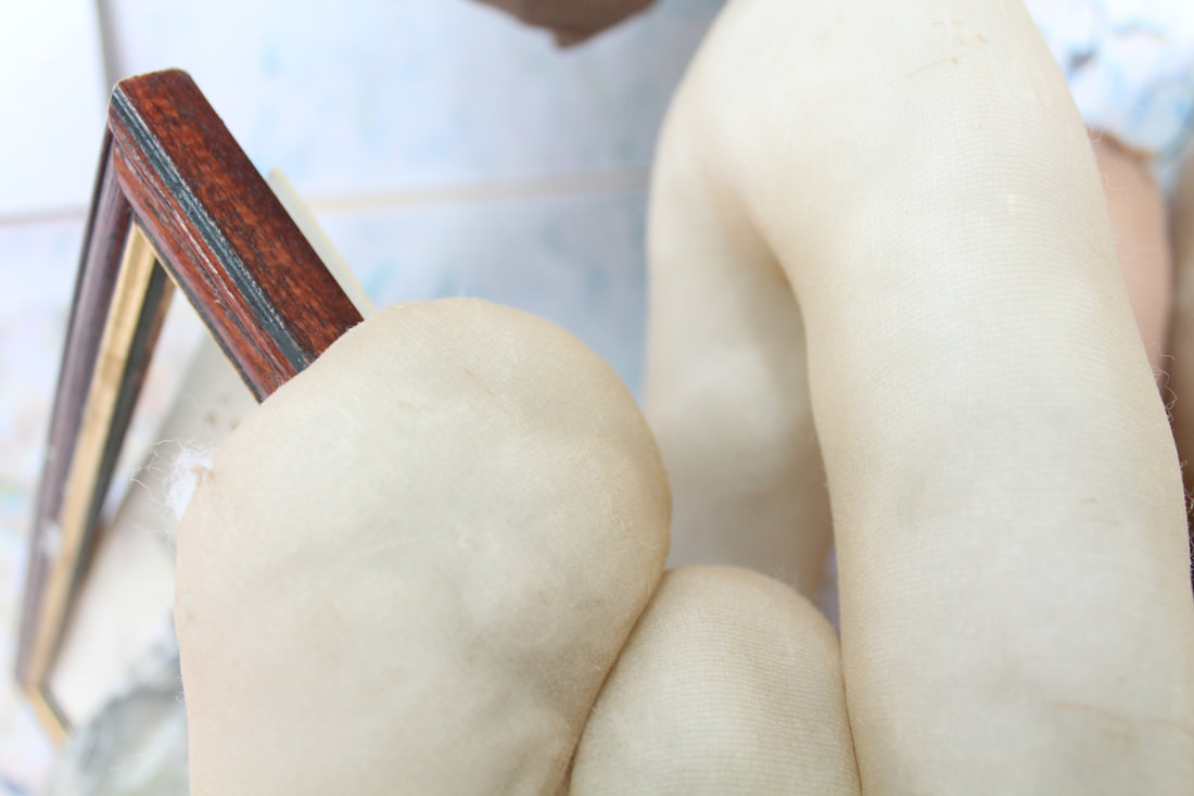
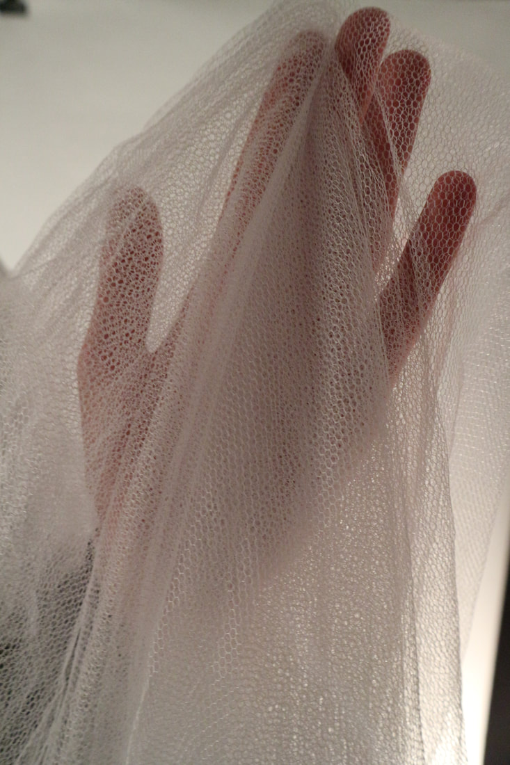
Theme 4: Isolation
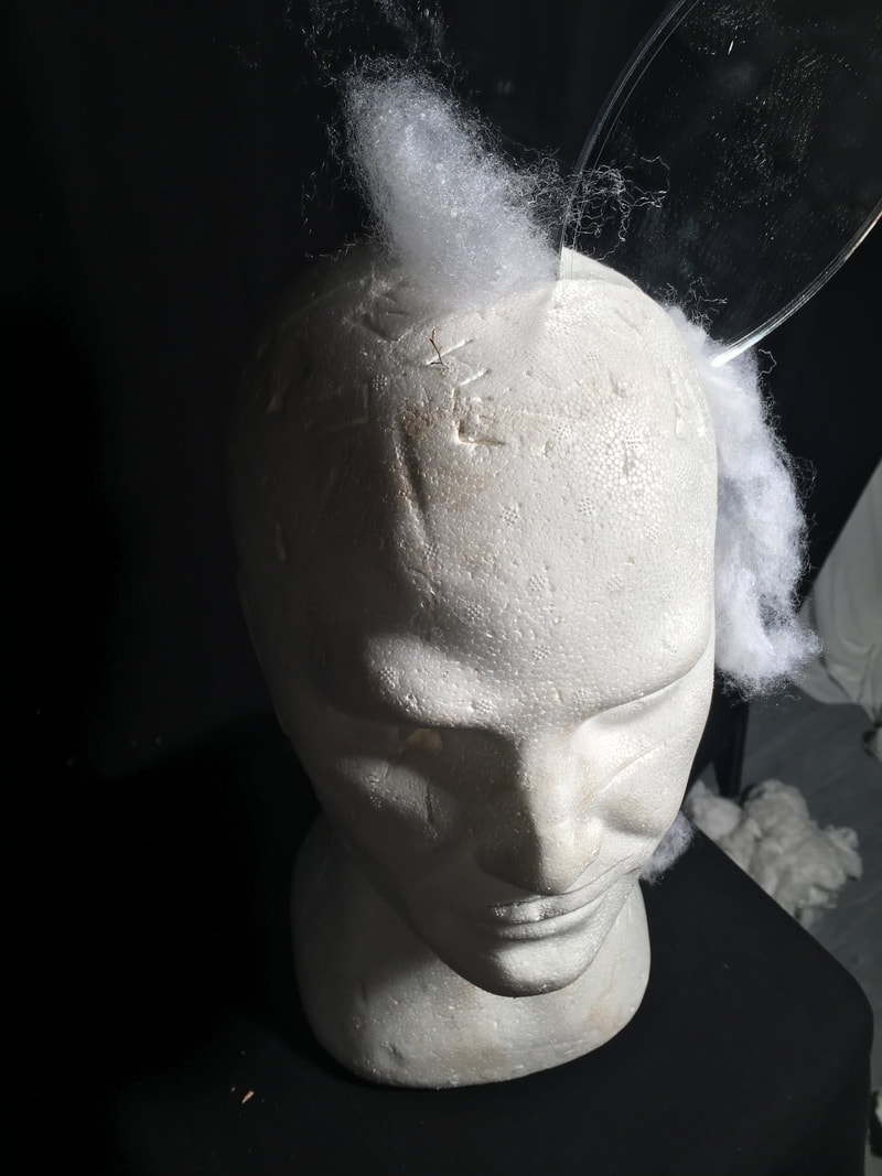
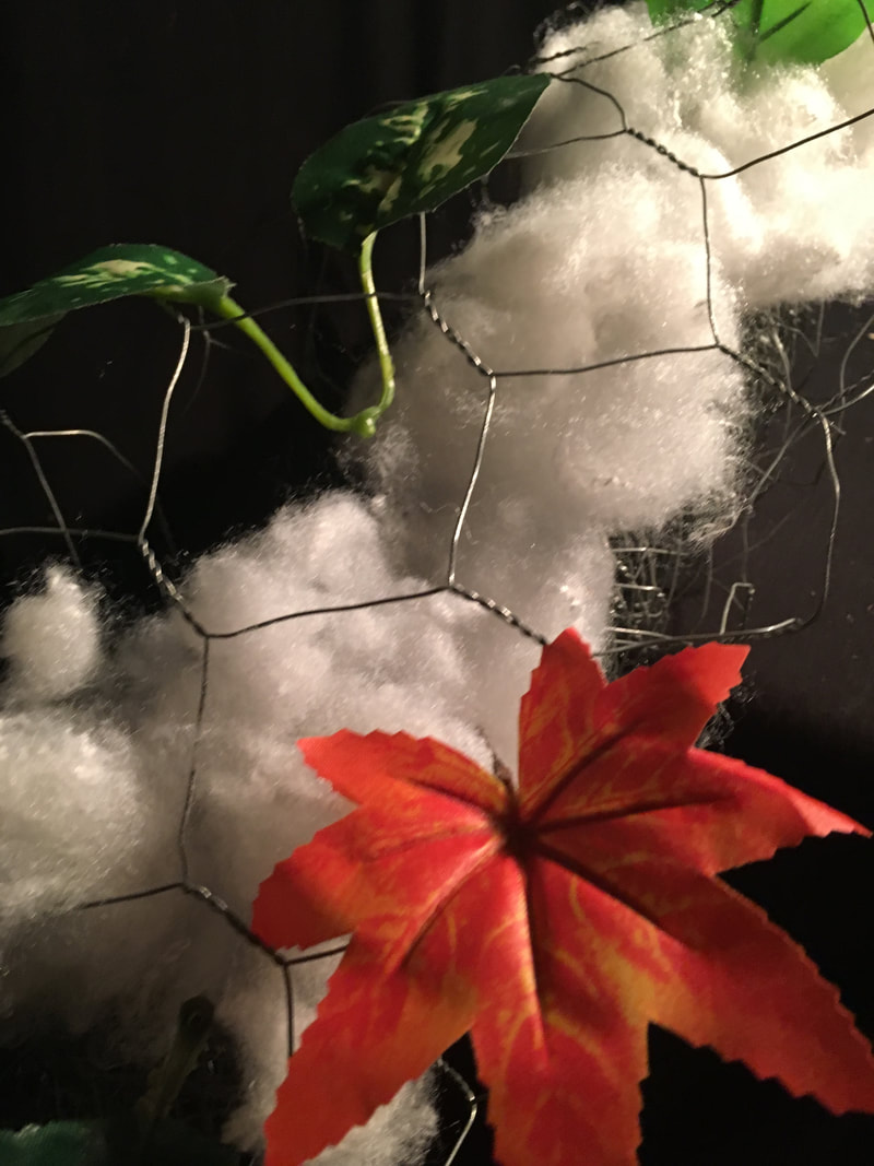
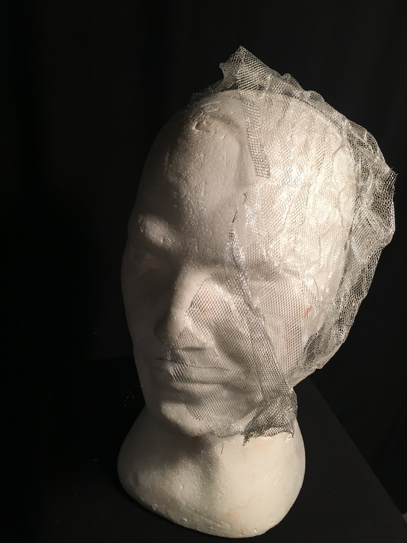
Another one theme that Bul regularly follows is isolation, she shows this by creating solo pieces and when I galleries they are clearly separated. I tried to recreate this by using a dark background to create focus on that image, this also creates contrast from the object and the background as they are different colours. All of these photos show a fake head mannequin which creates the impression of fake-ness which is emphasised by other objects in the frame such as metal sticking out of the head and metal foil. Things such as the mirror and metal pieces could be linked to cyborgs another thing that Lee uses in her work regularly. However, I wanted to draw attention to the head itself by using things to create attention such as a mirror that reflects the back of the head. I also wanted to explore the theme of 'utopia' by using lots of metal objects and an artificial leaf, to me this shows a utopian theme as its perfect and clean. To me if the world was a 'utopia' people would be lonely and therefore isolated as they would feel like they wouldn’t fit in. Furthermore, by using metal objects the create the impression of cyborgs it again shows the theme of isolation as robots wouldn’t fit into society and would feel lonely. One of my favourite parts of these images are the dramatic difference created between the back ground and white head.
Another one theme that Bul regularly follows is isolation, she shows this by creating solo pieces and when I galleries they are clearly separated. I tried to recreate this by using a dark background to create focus on that image, this also creates contrast from the object and the background as they are different colours. All of these photos show a fake head mannequin which creates the impression of fake-ness which is emphasised by other objects in the frame such as metal sticking out of the head and metal foil. Things such as the mirror and metal pieces could be linked to cyborgs another thing that Lee uses in her work regularly. However, I wanted to draw attention to the head itself by using things to create attention such as a mirror that reflects the back of the head. I also wanted to explore the theme of 'utopia' by using lots of metal objects and an artificial leaf, to me this shows a utopian theme as its perfect and clean. To me if the world was a 'utopia' people would be lonely and therefore isolated as they would feel like they wouldn’t fit in. Furthermore, by using metal objects the create the impression of cyborgs it again shows the theme of isolation as robots wouldn’t fit into society and would feel lonely. One of my favourite parts of these images are the dramatic difference created between the back ground and white head.
|

|
|
First Practical Lesson Review:
During my first practical lesson we had to create different abstract setups that where inspired by Lee Bul, i found this very interesting as we where given random materials that i wouldn't normally use such as metal foil and cotton wool. However i did find this challenging as originally i made the sculpture very flat which was unlike Bul's style so i had to change it to something with more height. Afterwards i experimented with lights from the studio equipment such as a directional light and diffused light in order to create shadows and reflections. By using different angles and playing with the lights we took a few photos, this also allowed us to have preparations for the next part of the task as i now knew what the different lights and angles looked like on camera. The second half of the practical lesson consisted taking pictures of set ups made by our teachers and changing them in order to fit the style on Bul.
During my first practical lesson we had to create different abstract setups that where inspired by Lee Bul, i found this very interesting as we where given random materials that i wouldn't normally use such as metal foil and cotton wool. However i did find this challenging as originally i made the sculpture very flat which was unlike Bul's style so i had to change it to something with more height. Afterwards i experimented with lights from the studio equipment such as a directional light and diffused light in order to create shadows and reflections. By using different angles and playing with the lights we took a few photos, this also allowed us to have preparations for the next part of the task as i now knew what the different lights and angles looked like on camera. The second half of the practical lesson consisted taking pictures of set ups made by our teachers and changing them in order to fit the style on Bul.

|

|
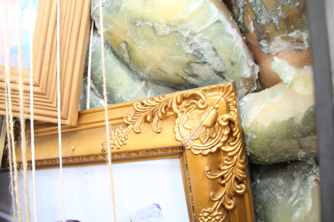
Changes made originally in order to look more like Bul's work
In the first image although it was inspired by Lee Bul's work we decided that not only was it too basic but it also lacked features to make it stand out. Therefore we took away most of the leaves as they haven't featured in Bul's previous work and added more items such as stones, sponges and a mirror. However the reason why we kept the metal foil and arm wrapped around each other was because of the theme 'cyborg' that she was inspired by and used in her work. We also kept the black background to bring focus to the sculpture as its mostly light colours and the same directional light held above in the left hand side. |
For me among the many themes that Lee Bul could be connected to, the theme utopia stands out to me as it can be clearly seen throughout her pieces. She creates this effect by using monochrome materials such as metallic metals that gives the viewer the impression of a futuristic space. Furthermore, much of her work is inspired by cyborgs, something of the future that again shows the idea of a utopian world as something perfect.
From this I felt inspired to bring this into by own work by using an artificial hand wrapped in metal foil to create the impression of a cyborg, I also added height to my sculpture in order to recreate her work. I would further use this theme of utopia in my work by using materials such as concrete to create the impression of sight-specific. The Hayward gallery where Bul’s exhibition is, is mainly made out of concrete which she made the sculptures for again showing the theme of utopia in it..
From this I felt inspired to bring this into by own work by using an artificial hand wrapped in metal foil to create the impression of a cyborg, I also added height to my sculpture in order to recreate her work. I would further use this theme of utopia in my work by using materials such as concrete to create the impression of sight-specific. The Hayward gallery where Bul’s exhibition is, is mainly made out of concrete which she made the sculptures for again showing the theme of utopia in it..
Top Three Lee Bul Pieces:

|

|

I picked these three items due to the fact that they all stand out for different reasons.
|
The second for example I picked because of how it reflects with the mirrors in the background without showing anything infant of it, as if reflects the figure. Furthermore I think that these where the best in the whole shoot (with the different backgrounds). Moreover, each different set up looks like Bul's work and how she makes her work look like. I think it successfully looks like her work but not in a copied way, which I was careful to avoid. By using themes such as macro, isolation, shadows and contrast that is all seen throughout her work it successfully looks like her work but not in a copied way which i was careful to avoid.
The Formal Elements
There are 6 different aspects that a photographer has to take into consideration when taking a photo: line, shape, form, tone, pattern, texture and colour. Line is one of the most important ones as the others rely on it to exist, because of this if there is no line there will not be pattern and therefore not shape. Shape is essential for a good photo, photographers use shape in a unique or interesting way. Form refers to three dimensional shapes and lighting is often used to enhance this. Pattern is the repetition of lines, shapes , tones or colour to create interesting images. Another important aspect is texture. Texture uses light to be fully shown, however is essential as it draws the viewer to look at certain parts of an image. Finally colour, this is imperative to the photo as it creates mood, emotion and also warmth. Artists can use these aspects in a number of ways. These are called the principles of design and they are: balance, contrast, movement, emphasis, proportion and unity.
Texture And Pattern In Response To Lee Bul
One of the main formal element Lee Bul uses is pattern, this is essential as it emphasises elements that are repeated. This can create interesting images by using repetition of limes, shapes, tones or even colour. Pattern can be made to be the main subject of an image however it can also be used to enhance the overall look of the photograph. Two techniques that can be used with pattern is emphasising and breaking. Emphasising a pattern can emphasis the sense of shape and expansion. Here you zoom in onto a pattern and fill the fame with it. Breaking is about finding an object that disrupts from the rest of it. Therefore it needs to be in clear contrast to the rest. Secondly, texture is about capturing certain things that only can be seen in certain lights.
Macro Photography
Macro photography is essentially taking pictures close up in order to pick up very small details such as dents ect. This portrays many of the formal elements such as form and tone.In order to take these successfully you should use a tripod or steady hand in order to receive a sharp image. A small aperture will be needed to leave the subject in focus while blurring the background. Generally macro photography is making smaller images larger then life size.
|
|
|
|
|
|
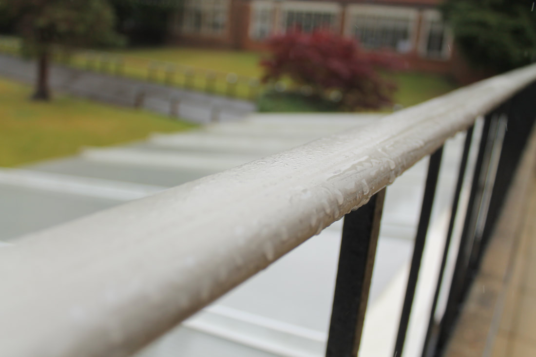
Aperture

|
Aperture is a hole within a lens, through which light travels into the camera body. When in dark lighting a large aperture is needed in order to collect as much light as possible. Depth of field is the amount of an image in focus from the front to the back. Small numbers have large apertures whereas larger numbers have small apertures.
|

|
|
|
|
|

|
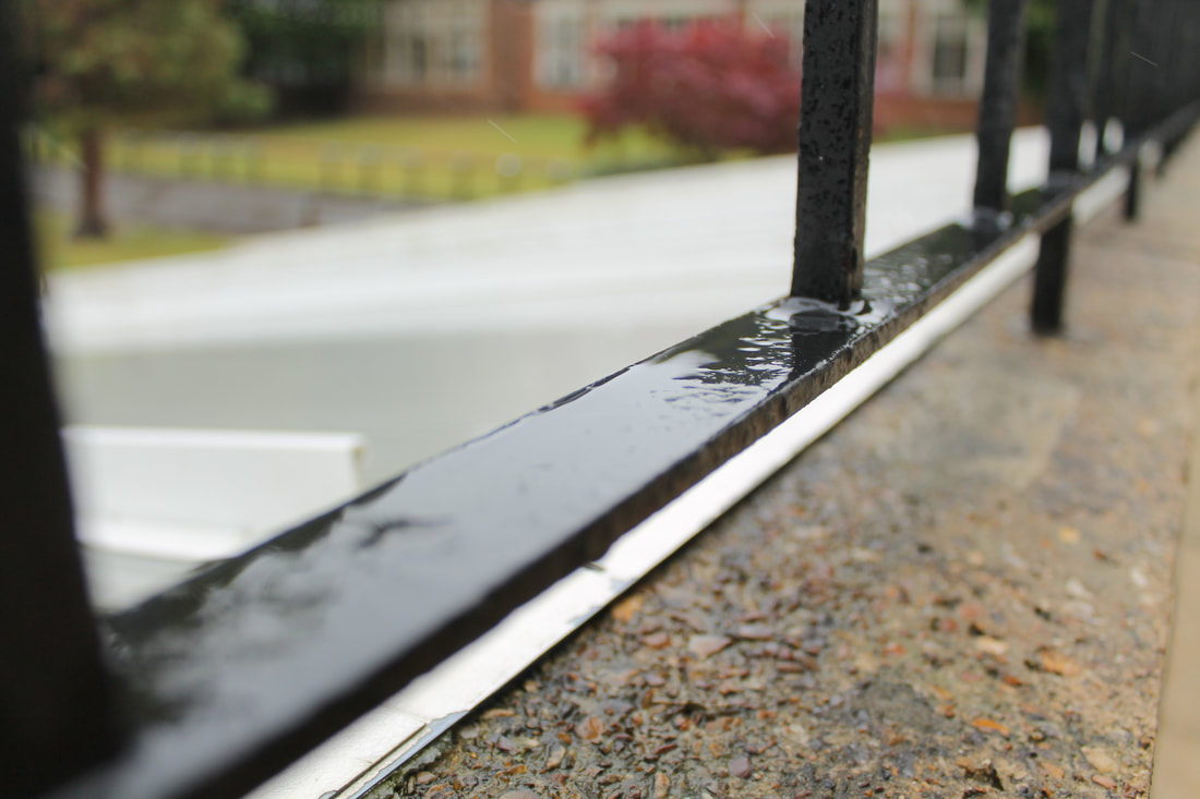
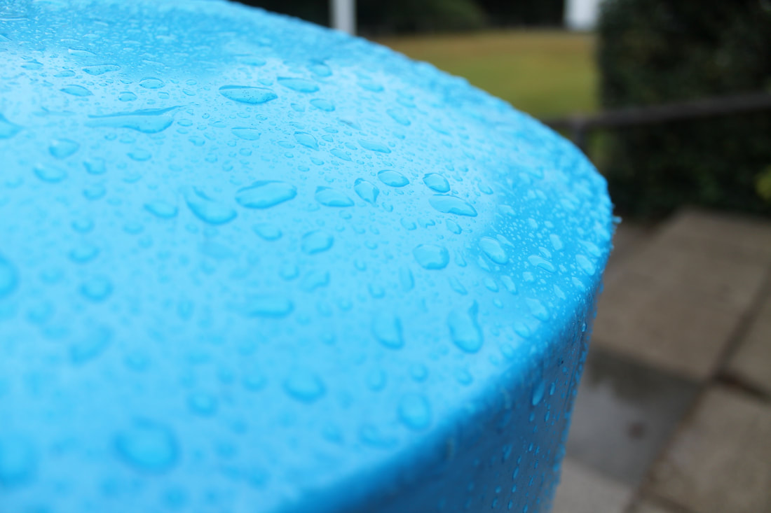
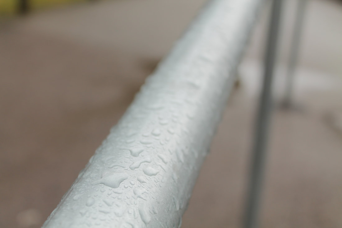
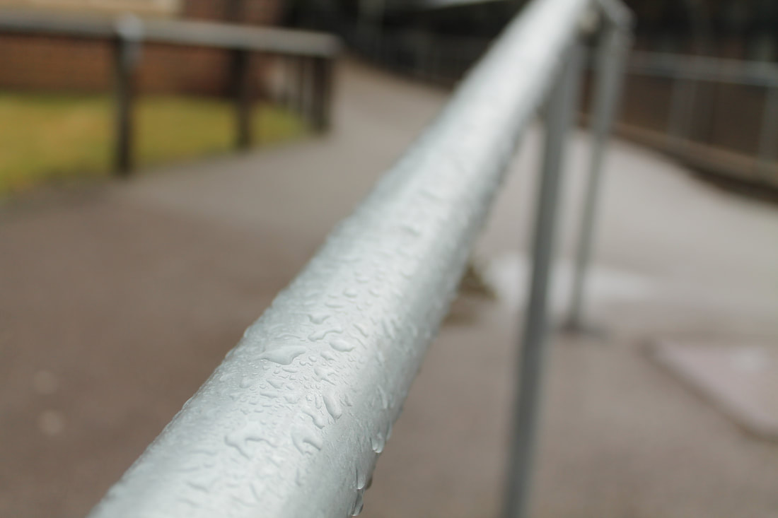
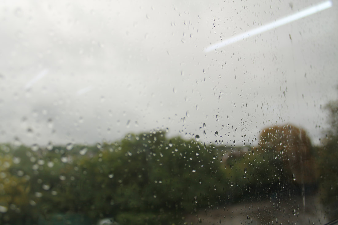
Chosen Photo
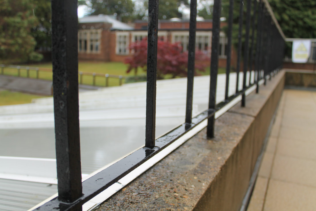
For my chosen edit for aperture is this one due to the focus point created for the raindrops on the railing. When taking the photo it has previously been raining and as a result the tiny details on the railing were enhanced. The main thing that stands out to me is the fact that the background is blurred and the frontal part of the image (the railing) is in focus. Furthermore, the contrast between the two main colours in the photo creates interest for the viewer. The railing is mainly silver which has a cool, crisp effect on the photo in contrast to the red bricks hat aren’t in focus in the background. Another detail that stands out to me is the small writing; this again creates focus and interest for the viewer. When taking these photos I experimented with focusing on different parts on the railing for example, the back part instead of being not in focus for it to be the part in focus instead.
Studio Photography
What is form?
One of the main parts of the formal elements is form, which is linked specifically towards three dimensional shapes. This is essential in order to take a good picture; this is created by shadows and highlights on the object. By using studio photography, you can increase this effect by using artificial lighting. Artificial lighting can be used as a substitute to natural light and even when there’s a lack of it. It can also be used to change colours that are shown in the photo, for example by using directional lights, this is much harsher on the photo. Many photographers use artificial lighting to take control of the light therefore to take a photograph and not just to take it.
Steps in preparing lighting setup:
1. Deciding on the general effect
This can determine on the type of lighting, like diffused or directional. Also, the direction and angle that it's placed at.
2. Add the key lights and place the fill lights
Here you need to decide the dominant light and decided effect of it in order to create a set of highlights and shadows.
3. Separate the subject from the background
Firstly a background light needs to be places. Also, the subject needs to be far away from the background so that no more shadows are created, distracting the viewer. Furthermore, the lights shouldn't me in the way of the model.
4. Making final adjustments
In order to do this you need to take sample shots with different settings, for example adjusting different apertures. Furthermore, looking out for unwanted highlights/ shadows and reflections of catching lights.
More key things to take into account when doing studio photography is making sure to repeatedly create form with shows and highlights. Due to this it's essential to not use flash as it takes out tone, therefore not enhancing the 3D characteristics. Different lighting techniques that can be used are spotlight/ directional and diffused. Diffused lighting is generally used for portraits especially as its known as the 'beautifying light'. The effect of this is very soft and elegant. whereas directional has much more high contrasts so has a more dramatic effect.
Different lighting
Rembrant lighting
Rembrandt lighting is a lighting technique that is mainly used in studio portrait photography. It is achieved by using one light and a reflector and generally produces dramatic effects. In order to shoot this, you need to place your main source to the left and right side of the objects and aim it down at the fact for a 45-degree angle. Keep adjusting its position until you see the triangle and the shadow to the side of and slightly below the nose. It is named after a Dutch painter Rembrandt who used this in his paintings. This is effective as it creates a sense of mystery and also clearly defines the shape of the subject nose.


Butterfly lighting
Butterfly lighting is a portrait lighting pattern where the lighting is placed centrally placed above the subject’s face. This then the creates the down under the nose that looks like a butterfly thus the name. It’s often used for glamour shoots and to create shadows under the cheeks and chin. It’s also flattering for polder people as it doesn’t show wrinkles as much. It is also known as 'paramount lighting' named for classic Hollywood glamour photography. I found that although this lighting was harder to set up due to the high angle however the results of it where very powerful by creating s dramatic effect that looks scary and sinister.


Side lighting
Side lighting is the light that falls on the subject at about 90 degrees to the camera. Therefore, one side of the face is lit and the other will be in shadow. Its purpose is to light a subject front from the back/ side so they have a glow. Harsh lighting should be used to create the contrast. It creates a confrontational mood.


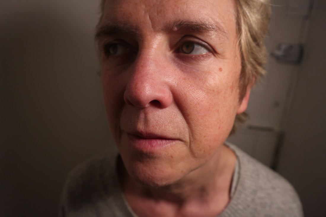
Myra Greene


Myra Greene is an American artist aged 44 who creates images of herself using a traditional photographic process called black glass ambrotypes. She uses these pictures to explore the construction of racial identity. This is mainly due to how slave traders used to take pictures of slaves using this process, this initially shows her exploration of racial identity. In her series called ‘character recognition’ which again looks into the character recognition of herself and how she as an African American woman is different to others, one of the main inspirations behind her work. In her project she takes close up pictures of her face, showing she is exploring her identity. In the photos she is visibly uncomfortable which links back to how the traditional photographic process black glass ambrotypes needed to be taken close to the subject so the image shows. Moreover, when slave traders used to take the photos they would be very rough with them, treating them like livestock. This again is shown in the photos especially due to the facial expressions. By doing this she is linking back to the past of her race, this is also emphasised by using the traditional process of black glass ambrotypes. Furthermore, the racial stereotype and recognition associated with her race.
Greene writes “throughout my artistic practice, I have returned to the body to explore issues of difference, beauty, physical and emotional recollections as they play out on the surface of the skin”, for me this means that she uses her own body and therefore her race’s past to emphasis the message of the construction of racial identity. One way this has changed my work is using a natural subject, like Greene has. To show this I made sure not to over edit my photos.
One of the main things about her work that stand out is how she uses traditional photographic processes; this particular method is associated to the history of colonialism and slavery as it was used as a way for classifying different slaves as if they were livestock. By using this she again relates back to the theme of race in her work. This photographic process used in the 19th century creates a very strong link between her own personal investigations and to also her racial history. The impact of this is powerful and dramatic, the viewers can see how passionate she is about the history of her race due to her using this technique. Greene is taking pack power of this as slaves were forced to take these pictures in uncomfortable situations. Now she is taking them by choice, this again shows how important this is to her. As she used this specific technique, Greene is shaming the history behind it, again emphasises the effect she creates. This could also suggest that things haven’t changed as people still have stereotypes and haven’t changed.
Her work is unique due to the eye-catching detail of black glass ambrotypes because it’s not a very popular one to use it. Mainly due to how difficult it is, the images need to be taken very close up to the subject and is difficult to develop. The wet plate collodion process has a good quality as it shows specific details such as the person’s pores and especially adds to the detail to the portrait. Furthermore, a very dramatic contrast is created in the photos which adds an emotional and atmospheric impact for the viewer to see.
Many of her photos are taken with a narrow aperture causing only one aspect of the picture to be in. Furthermore, she uses small and close-up framing which is all exposing. This also creates the impression that is uncomfortable and unescapable. These show every facial feature such as the flaws, bumps and scars, this creates an intimate raw version of Greene. This intimate framing exaggerates all of her features, also as they are in full frame there are no distractions hindering the focal point. This immediately attracts viewers as they are nothing distracting them from the centre of the photo however with her work this isn’t always in the centre. Generally, the focal point isn’t in the centre as the image isn’t taken with central framing.
The photos that Myra Greene take are very similar to the way in which slave traders would take of the slaves before they where sold. In these photos’ traders would take very close up images of their noses, mouths and even teeth. Moreover, they would be judged about their looks such as how dark their skin colour was. The darker the skin meant that they had spent more time outside often meaning they were better at the work as they had more experience. Another way they were judged was on how their teeth looked like, if they were healthy it meant they were strong and therefore healthy all round. This again shows her intentions of showing her exploration of race as it was used on slaves in the 19th century.
Greene’s work tries to convey the message that almost everyone still has stereotypes when it comes to race. She said that she felt when she was in public she questioned if people only saw her as black person, “Am I nothing but black? Is that my skin tone enough to describe my nature and expectation in life? Do my strong teeth make me a strong worker? Does my character resonate louder than my skin tone?”. This quote shows that she believes that some people only recognise her for her race/ skin tone, that slave traders did as well. Slave traders would look for strong teeth as they would sell for more.
The title of her work ‘character recognition’ links very well to her work especially as it continues her theme of race and identity. The word character creates the impression of movie star and book characters that are both fictional and built up. Greene here is playing that part of a slave in the photos. This makes them very unpersonal to the viewer, letting no information about the person in the photos clear. This again refers to how she doesn’t want any part of her to be hidden as she’s completely natural and raw. The second word recognition refers to how someone’s specific features standout and how other recognise them for it. The whole title together could mean that the character here is Greene herself and the recognition is us, as we are forced to piece things together. Her work is personal to me mainly due to how I personally may inherent my own stereotyping by recognising race.
|
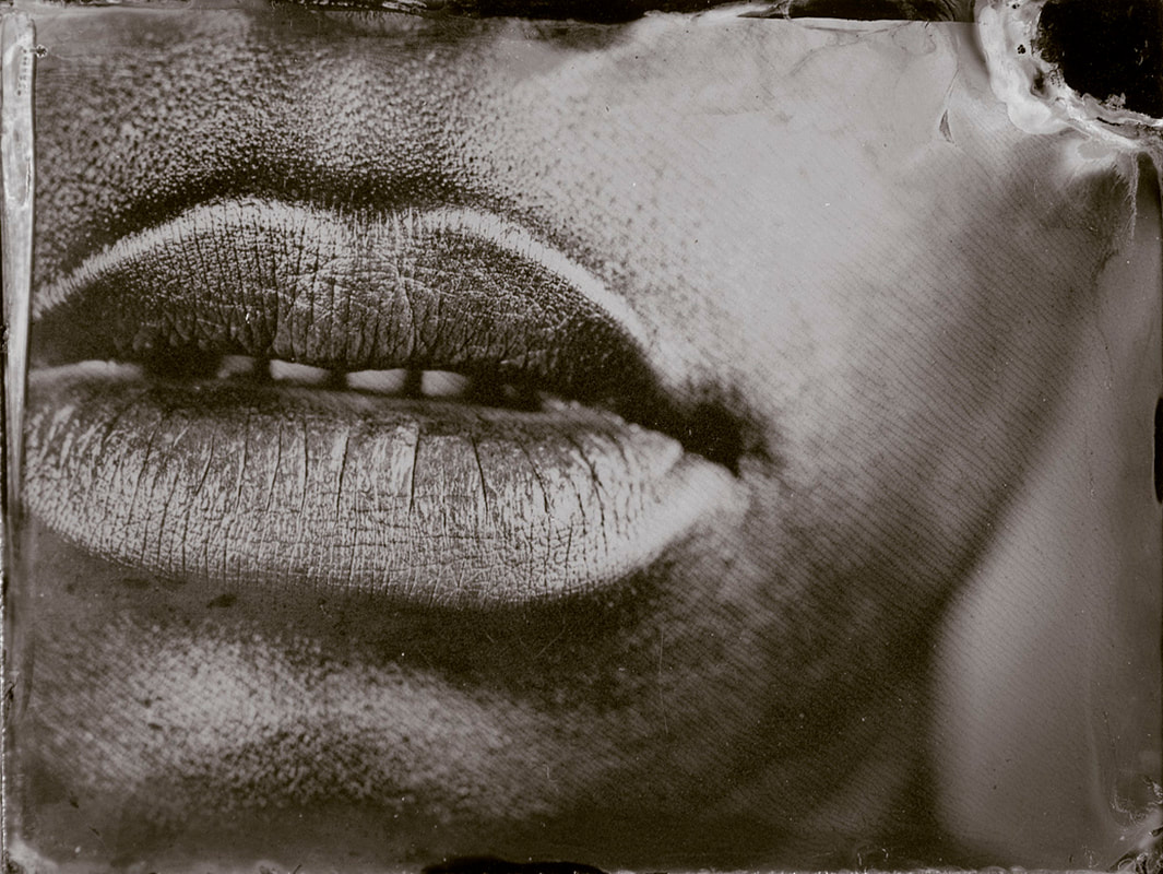
One of the main images that stuck out to me was this one. In the photo it shows Greene’s lips with her teeth in the shot. Moreover, the background of it is in focus suggesting that she used narrow depth of field in order to focus on a specific area. This also creates a focus point on the lips. She uses intimate framing to emphasis this focus, because of this it shows details such as pores and creases in her skin and lips. Greene also uses a soft light such as a diffused light to enhance her features and make them stand out, this is evident with the shadow created around the lips. One of the main parts that stand out to me apart from her lips is her teeth, which stands out due to the black and white filter again creating a focus point. Furthermore, the light used emphasises the creases in her lips show the ‘raw’ self-portrait which again show her exploration of racial identity.
In conclusion, Myra Greene’s work links to my project by using self-portraits as a way of expressing her background. By using a 19th century photographic process that was used by slave traders when selling slaves, she reclaims it by choice. As slaves would have been treated very badly while taking these certain images, she shows this by showing visible discomfort but shows power. This artist has inspired me to explore using effects such as black and white filters specially to create a dramatic effect such as the ones she uses. One of the main things that Greene tries to show through her work is the theme of what people see when they look at the photos. Personally, I think that her intentions as the viewers of the photos is for us to judge her. Therefore, the images aren’t just self-portraits their opportunities and invitations for us to judge her. What do people see when they look at me? |
|
Practical Response To Greene's Work
In today’s lesson we explored taking close up photos of each in the style of Myra Greene. To show the style of her work we took them up close in order to capture every facial feature to show all the detail such as creases in someone’s lips. By doing this it created a few issues for the camera, so we had to try out different lights, apertures and even iso levels. Eventually I settled on using a directional light and a tripod to stop the any potential blurs from happening. When the lesson was over, I also took photos of my family members at home. I also had problems with the lighting as I no longer had access to studio lights. However, I overcame these by using a lamp that acted as a directional light and a white background. Furthermore, I used a narrow depth of field to create focus points on certain points while the background is blurred.
Studio Photos


|
|
|
|
Home Photos


Photo's Edited In The Style Of Greene
By using Photoshop, I attempted to recreate the same effect as Myra Greene. I found this challenging especially when trying to create the balance of black and white on the histogram while trying to avoid burn out areas. In order to create the same effect, I firstly changed the colour scheme by adding a layer of a black and white filter and then adding another one for the colour scheme. Here I edited the reds, yellows, greens and blues however I found that only the red and yellow one created dramatic difference so therefore only used those ones. Then using a different layer of a black and white histogram I edited the black and white features of it so that the images weren’t too exposed or grainy. Finally, I used the burn and dodge tool to enhance the focus points of the areas I wanted to be focused on. While cropping the image I made sure to use the rule of thirds again to create focus points with all of them. While comparing my pictures towards Greene's work I realised that she had added a warm filter to her work to make it a 'warmer' black and white filter. Therefore, I added another layer with a colour filter


|


|

|
Chosen Edit

My chosen image shows the lower part of a woman’s face, with her lips and nose in focus. Whereas the background, that shows the shoulders isn’t in focus. Moreover, only half of the face is shown due to the light being side lighting. The subject matter isn’t obvious because her whole face isn’t in the shot. Also, no distinctive features are shown such as the eyes and the ones that are (lips and nose) only half of it can be seen because of the side lighting. The photo doesn’t question the viewer to wonder what is going on because no obvious emotions are presented. Its unclear what she is feeling.
One of the main reasons I choose this photo was due to the intricate detail around the face that’s enhanced by the directional light I used. When editing the photo in Photoshop I used the red and yellow tones in the photo to further show these details and made sure not to make the photo too dark. The main details that can be seen are slight wrinkles around the lips, creases on the lips, pores in the cheek and freckles. My favourite detail of these is the freckles as it adds further texture and interesting aspects to the photo. Information that you can infer about the photo is limited again mainly due to the lack of emotion and facial features actually shown. As the lips and nose is only shown it makes it hard to figure out what she is feeling however, she has a straight expression. This is very much like Myra Greene's especially because she either has straight faced or uncomfortable expressions.
The work itself is very mysterious and lacks any information about the subject matter, like a lot of Myra Greene’s work does. Furthermore, because of the side lighting this emphasises the mysterious mood with it. The side lighting creates a focus on only one side, as the other one can’t be seen. Also, this impact is emphasised as the viewer cant see that her upper face is doing. When taking the image I used a diffused light pointing upwards from her face with a plain white background. Due to this it creates a focus point on her face, as the background is not distracting. Moreover because of the lighting and editing applied it has become dark again creates focus on the subject and further showing this mysterious effect. The lighting used is side lighting and only shows half of her face. The light is reflected on the lower part of her lip and tip of her nose. It can also be seen on the cheek emphasising the pores, wrinkles and freckles on the face.
In my opinion, this is my most successful chosen image because of its likeliness towards Greene’s work. In Greene’s image one of the main things that stand out is the contrast created between the shadow and highlight of the lip. Moreover, I deliberately cropped it in order to look like the framing of hers using the rule of thirds. When editing I made sure to use the black and white layers on Photoshop to edit the layers of red and yellow. Furthermore, I added a filter to recreate the one she uses.
Line And Shape
Generally, line is one of the most important elements in photography as it leads the eye through the photograph. Therefore, it’s a good way of improving an image and composition of it. Shape is the second most important element in photography as it provides the means for identification. There are five types of lines in photography: implied lines, vertical lines, horizontal lines, curved lines and leading lines.
Implied lines are not the lines we would usually first see but are made by the way the object is placed in the photo.
Vertical lines run up and down the photo, the creates a sense of height in the photo.
Horizontal lights create an atmosphere of peace and calm, this could be a landscape photo for example.
Curved lines are mostly about beauty, an example of this is a river.
Finally, a leading line leads your eye in to a picture. This is things such as a road or river. If done properly this should lead your eye in to the picture and take it to the main subject and centre of interest.
Examples of line:


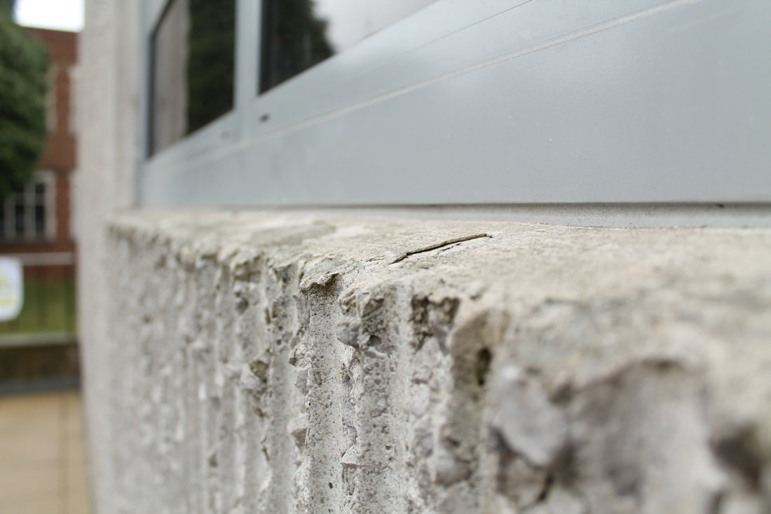
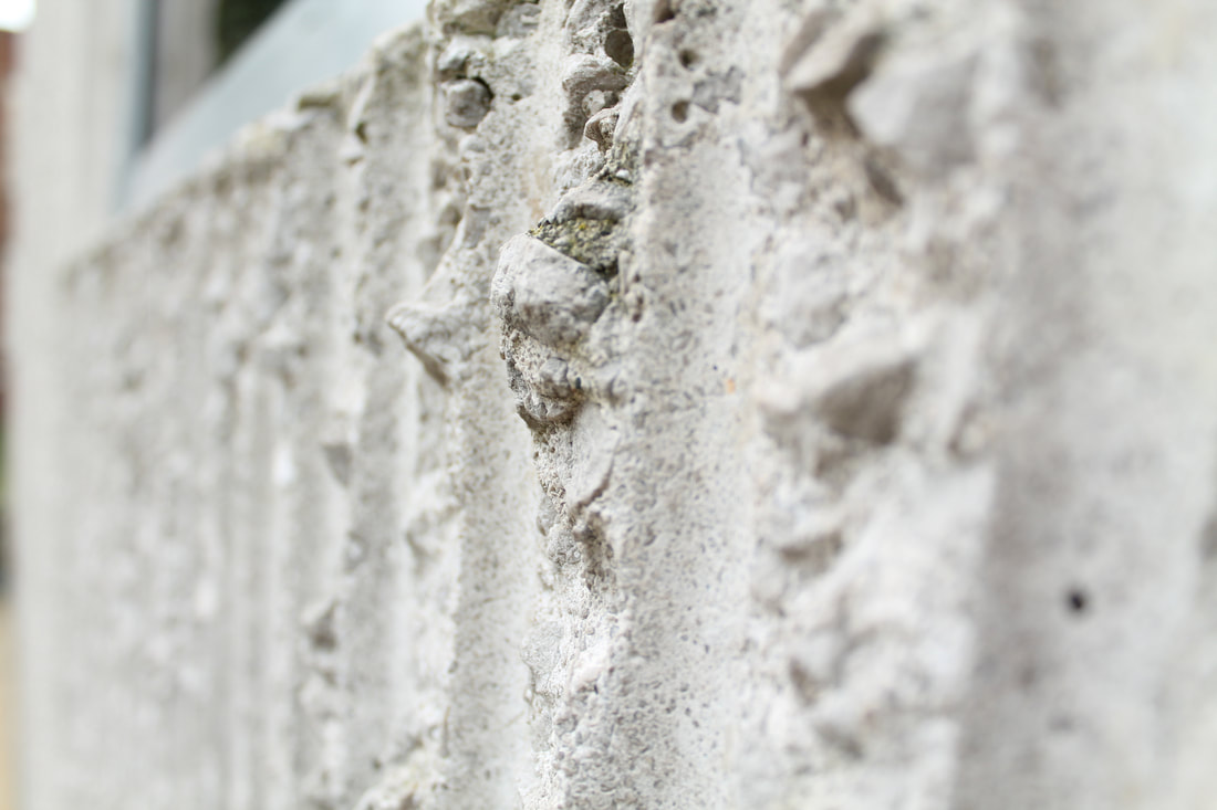
Around school:
While using the same style as Simon Phipps I went around school taking pictures of things such as the buildings, railing, roofs and materials to recreate his work. By using the line, I took the photos in a way that he would by using the main formal element line but also ones such as pattern and tone. While rotating around the school I found different things, the roof and railings being my favourite to use as a subject matter. I also used photo techniques like aperture to experiment on different things to focus on, for example having the front part of the railings in focus but not the back. Furthermore, I used shadows. this especially can be seen with the images of the corner of the fire alarm and wall next to it. The shadow creates a strong dramatic shade that emphasises the where the wall creases. Throughout I generally tried to make sure that all the lines where matched up and not bent however this could be fixed in photoshop if needed.
While using the same style as Simon Phipps I went around school taking pictures of things such as the buildings, railing, roofs and materials to recreate his work. By using the line, I took the photos in a way that he would by using the main formal element line but also ones such as pattern and tone. While rotating around the school I found different things, the roof and railings being my favourite to use as a subject matter. I also used photo techniques like aperture to experiment on different things to focus on, for example having the front part of the railings in focus but not the back. Furthermore, I used shadows. this especially can be seen with the images of the corner of the fire alarm and wall next to it. The shadow creates a strong dramatic shade that emphasises the where the wall creases. Throughout I generally tried to make sure that all the lines where matched up and not bent however this could be fixed in photoshop if needed.


Chosen Images With Edits


Favourite Image:

When taking this photo in the style of Simon Phipps I focused on using line and shape throughout my work, instead of recreating photos exactly like Phipps. Therefore, for my favourite chosen edit its one that he wouldn’t normally use. the photograph is a close up on a banister that’s curing as it goes around a corner. One of the. Main reasons this particular part of the stairs stood out to me is due to the different lines that are presented. The main focus point of is the lighter thicker one on top however underneath there is a smaller one that’s black. Together with the edit they complement each other. The matter of this is enhanced with the black and white edit that Phipps uses, that I’ve therefore recreated. The lighter parts have a reflection for the lighting above it. Furthermore, on both different sides they have the same amount of highlight on them. Some of the small details that I noticed was how the railing begins and ends at the same point, on opposite sides. Again, creating a satisfying photo. Also, as there are curved lines and vertical lines this further shows how there is different lines that can we used and how they work well together. The work is quite moody and dramatic due to the filter that’s used however it also has few parts of highlights and reflections on it that lightens the overall effect. For me this links to Phipps work as he uses line in his work frequently and I’ve recreated this through these photos with this one in particular.
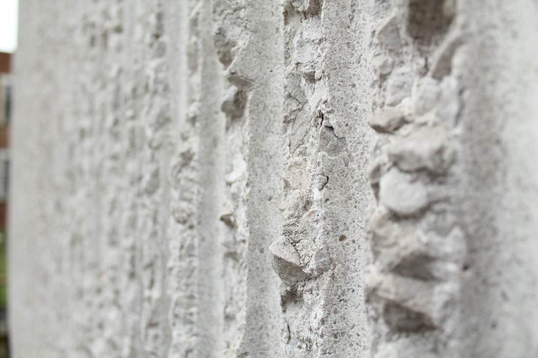
Simon Phipps


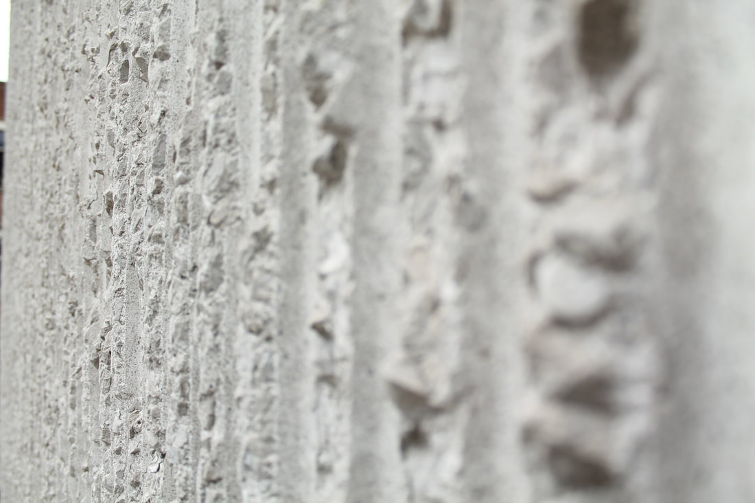
Simon Phipps is a British photography who focuses on architecture and post war buildings, that are generally in the style of brutalist architecture. Brutalist Architecture are known for their massive, monolithic and blocky appearance. They also have a rigid geometric style that compliments the formal elements of line, form, pattern and even tone. The majority of the buildings are made from concrete which also creates the impression of a 'reaction' against artificial elements. His work is expressed through pictures of large exposed materials of concrete and bricks on buildings again linking to the brutalist buildings. Much of his work is memorable due to its monochromic images that give a unique and different perspective on how the buildings are usually portrayed. Examples of his work are buildings such as the Halifax building, Hayward gallery, Queen Elizabeth hall and the Barbican estate.
Brutalism photography was mainly started post war due to the need for new buildings for living and working in. Instead of using expensive and time-lengthy materials, concrete was used instead. Despite what many might assume brutalism doesn’t get its name for its savagery or viciousness but is taken from béton brut, meaning raw concrete in French. One of the main reasons many artists and photographers choose to use these sorts of buildings in their work is because of its intimidating and overwhelming effect on the image. Although the buildings are stark it creates a focus point on them as there is nothing else to look at. Especially with Phipps work as there is a monochrome background with nothing to distract the viewer. Generally, the use of these buildings in photos is very dramatic and moody because of its size that emphasised by the perspective that it is taken at.
Although, Phipps doesn’t specify specific camera techniques what he has used the majority of the images are taken with it face onto the subject matter or facing up to it. Again, emphasises how overwhelming and dominating these buildings are. When editing the photos, he uses a black and white filter that makes the different tones of the concrete stand out. Furthermore, it makes it moodier and more dramatic which adds to how powerful the image is. When editing the photos, I took in response I made sure to use a black and white filter as well but experimenting with the levels of the photo in order to not over whiten or darken it. I also used the cropping tool t make sure that there was nothing in the frame of the photos and by using the rule of thirds I made sure that the focus points where empathised.
In Phipps work I think that he may be trying to communicate how dramatic it can be. Although his work is white basic and simple the edits in it make it more intimidating and powerful. Furthermore, using brutalist buildings I think he’s trying to create attention towards ones like it as he’s clearly passionate about it.
The colour scheme in his work is very bland using mostly black, greys and whites however there are many tones in-between them creating interest for the viewer. Especially because it complements the formal element of tone.
"Phipps, in effect, follows through his lens the rebuilding of Britain after World War II. His numerous photographs of Brutalist masterpieces not only appeal to the eye and refined tastes, but also ‘recognises the architects’ enormous contribution to the transformation of the political and social landscape of the country’ in the aftermath of the war."

|
One of of my favourite picture Phipps has taken is this one. It stands out to me due to many different tones it shows, although the image has had a black and white filter there are many different shades of these colours in it. The picture was taken outside the national theatre by Southbank, where I went to take my photos in response to Phipps. Although the building itself could be considered quite bland, as its only made from concrete and wood in a dull colour underneath there is a pattern of sideways squares that look like diamonds. This creates interest for the viewer as it intrigues them to follow the lines. Simon Phipps uses line regularly throughout his work in order to emphasis the focus point. If leading lines are done properly it should lead the person’s eye to the picture and take it to the main subject and therefore centre of interest. In this particular picture of his there are many lines present, one of the main ones are a repeated one of a shadow. The shadow created by an overhead part creates a clean line across. This creates both a moody and dramatic effect due to the strong contrast between the part in the shadows and the other side that isn’t. Brutalist buildings can be very overwhelming and powerful and aspects such as highlights and shadows in the photo enhances this. As the photo is taken in clear focus lots of details are shown such as the different blocks of concrete and tiles on the floor, again adding interest for the viewer.
|
At the Southbank:
For my personal response I went to Southbank, London to take pictures to nearby brutalist style buildings and structures. Many of the buildings built there were built post war from 1950-60s and the style dominates the area. When shooting I focused on buildings such as the Hayward Gallery, the National Theatre and the Queen Elizabeth Hall. Generally, the buildings are quite high up so it’s difficult to have a wide range of levels however I tried to take the photos at different angles to avoid this problem. One of the reasons these photos stand out to me is due to the almost monochrome background, because of the rainy weather that day. As the background is almost white it makes all the buildings and structures emphasised and creates a dramatic effect. Furthermore, although all the buildings have the same material of concrete, they are all different. For example, the building for the national theatre has a square-shaped pattern that looks like diamonds due to the angle. For me these photos also stand out as they use some of the formal elements such as pattern, shape and tone. When taking these photos, I used a manual setting with an average aperture of f/.6 and an automatic iso.
"When you you see the hard cold concrete of a brutalist building, they can look very inhuman, like a machine-made building. But if you stop and think about how they were actually made you start to realise that really they’re a very deep expression of the craft involved in making them."


Chosen Images With Edits


Favourite Image:

For my shoot at the South Bank if focused more on recreating Phipps work exactly, especially as some of his work was taken there. One of the reasons this photo is my favourite is due to the range of different lines that take your eyes on a journey when viewing it. As there are many shapes presented on the building, it creates many different lines in the photo. Furthermore, in one side of the building there is a pattern of stripes again showing lines as one of the formal elements: pattern. Also, as the whole building isn’t in frame it further shows different lines through it and creates mystery for the viewer especially as it’s unclear what the bottom or sides of it looks like. Although the building itself is very basic as it’s made from concrete with average shapes such as cuboids the different lines and shading adds interest and complexity. The lines that catch the viewers eye to be drawn into a journey exploring the image and adds sense of depths because as the eye wonders more is discovered. Furthermore, as the image has a black and white filter like Phipps work creates an intense tonal contrast with the dark building and white background. Also, due to the lighting shade and tone is created making a ‘basic’ building more complex.
Michael Wesley


Michael Wesley is a 56-year-old German art photographer who is mainly known for his long exposure style of photography. This style of photography uses a much longer shutter speed in order to get a certain effect. This helps trace and record a pattern of time and see things that wouldn’t be picked up with a normal shutter speed. In order to take photos like these you need to keep the shutter open and aperture as small as possible, so the camera captures everything bright that moves in the dark. Wesley spent years working on different techniques for long camera exposure that went up to even 2-3 years. He started his experiments with ultra-long exposure from several weeks to several months.
Another example of his work is in 1997 when he left a camera in front of a building in Berlin with an open shutter from 26 months. During this time there was reconstruction on the building and therefore it changes shape and is preserved in one frame. The removing objects are blurred together with images of static objects that were demolished covered in other layers. By leaving the camera for such a long time he questions the boundaries for what a photo actually is.
"His photographs are endlessly long; they literally preserve time."
Wesley’s work forces people to question what photograph actually is as his work shows that is not just a snapshot at a certain time but something that has the ability to document an object over a period of time. This long exposure allows a narrative to be drawn towards the image.
However, Wesley’s work doesn’t just specialise in buildings and square but also other things such as flowers and people. These don’t last long, only from a couple of minutes to several days. In 2013 he released a book of more than 2oo portraits shot using this method. He placed a camera in front of a model and set the exposure to 5 minutes or less. Wesley believes that in this time “the person opens up more than during the usual immediate shooting.”
“Time is like a vehicle I use to arrive at my ultimate goals – images,”
For me Wesley’s work carries lots of meaning and creates many questions. It makes the viewer question what is time and its purpose? Time is a continuous progress of existence and event occur surrounding it from the past through the present to the future. Time is just recorded movement.

|
One of my favourite images of Wesley’s is this one. In his photo it shows a building that is under construction, with parts of scaffolding around the edge of the building. This has been added and taken away as the photo has been taken over time with a long shutter speed. The image stands out to me due to the skyscrapers that frame the image but also the rest of the city that is unfocused and therefore makes the focus points of key buildings emphasised. In this specific photo Wesley places his image on the museum of modern art’s facade, which captures a three-year renovation job on the building. The subject matter isn’t very obvious due to reflections on the camera lens. This can distract the viewer from the main building but also draw attention to other aspects such as the skyscrapers in the background. The small details that I notice when looking at the photograph are things such as the trees in the front left hand side that barely move as the photo has been taken. Compared to everything else this seems to be the only thing that has no movement. Another thing that stands out to me is the lines at the top of the photo from the sunrises and sets. The composition of the work creates an impression of collision of the different types of buildings. In the corner of the photo there is quite a traditional representation of architecture whereas in the middle there is a new modern building being built. This creates the atmosphere of change and recreation, which is especially true to the place of New York, where the photo is set. For me, this makes me question if humans are moving too fast and we should be happy with the buildings we already have. However, at the same time Wesley’s work creates the impression of time and journeys so therefore change, which this image shows. Furthermore, the black and white filter creates a dramatic effect as there a strong shadows created. Throughout this photo the photographer continues to challenge the viewers perceptions, as there is many aspects in the image such as the scaffolding on the building.
|
Personal Response To Wesley
When taking photos in response to Michael Wesley on experimenting using long exposure and shutter speed. When taking the different photos, I used different shutter speeds and iso speeds. All while looking at Wesley's work for inspiration, in my photos I took pictures of a bunch of flowers in a glass vase that he did as well. Furthermore, I also took photos of some building outside and photos of people. When taking the photos, I found it difficult to find the correct camera setting especially when using the shutter speed and the iso. As he takes the photos over long periods of time with special equipment that I didn’t have however, after trying out different shutter speeds I found one that gave me enough time to move the subject in front of me in order to get a picture like his. A good example of me doing this is by using cars. I found that by taking pictures of cars moving when it was dark resulted in photos capturing the lights moving. This also took a bit of experimenting as I found the iso was either too low or too high for the lighting. Furthermore, I had to try out a few different shutter speeds to find one that captured the movements correctly.


Re-evaluating My Response
When editing the photos, I had taken in response to Michael Wesley I found that by layering the same/ different pictures in Photoshop gave a more accurate response to his work then the technique I was doing. Previously I had been taking photos with a low shutter speed with a moving subject in an attempt to look like his work. However, this was difficult as by doing this, as the quality of the photos was no longer clear and also much harder to take many different perspectives. Therefore, my work had less range and I decided to re-take the photos I has taken without the low shutter speeds. As a result, my new photos that I have taken are with an average shutter speed so it’s a clear image that I can now edit with different layers like Wesley. In his work he takes the photos over a long period of time as the subject of the photo is moving e.g. a building being built or renovated. A lot of his work is in urban areas with buildings such as skyscrapers, that my previous photos didn’t have. With this new response I can now add numerous layers easily, which will have a stronger response.
Second shoot in Kings Cross:
When taking these new photos in Kings Cross, I attempted to use subjects that Wesley does in his work, such as cranes, scaffolding and skyscrapers. My previous photos had different things such as people and flowers that although Wesley has shown in his work but most of the photos he takes are of buildings. Therefore, I went to this specific area due to the new development/ regeneration projects that are taking place there. Wesley normally would set up a camera in front of these subject matters over a long period of time with a low shutter speed however I can’t do this. Instead I edited them in photoshop with the separate photos and layer them in order to look like his.


Chosen Images With Edits


Favourite Image:

One of my favourite photos I edited in response to Wesley was this one due to the different perspectives It has. By using layers, I added the same building numerous times to the photo with different angles and sizes. I also did this with the cranes in the background. Throughout Wesley’s work he uses the theme of reconstruction on older buildings, I tried to recreate this by using the cranes in the photo. In most of his images it shows the movement of objects such as the building materials, the cranes show this. Furthermore, as the layers used are the ‘darkened’ ones from photoshop the viewer is still able to view the older layers/ original parts of the image which Wesley does in his work. When editing these I made sure to add a black and white filter along with the layers also, using the highlight and dodge tool to enhance some parts of the specific image. This filter emphasises the dramatic mood the photo creates giving it more atmosphere. Wesley’s work is quite chaotic and creates confusion for the viewer this creates the impression that the image is moving, and vibrating. As the images are time-lapses this creates change and locks the time into place, something I attempted to recreate with this edit. When shooting for these photographs I took them in kings cross, an area where currently lots of reconstruction is taking place between old to new buildings which many of the buildings in Wesley’s work includes this transformation. This time movement physically doesn’t have the same structure as a normal image due to the long exposure shot.
Picasso's Light Paintings


Picasso born in 1881 was a Spanish painter, sculptor, printmaker, ceramicist and stage designed. Due to his varied amount of skills he was able to create a range of different work including his light paintings. At a young age he showed a passion for drawing and painting, as by the time he was 13 he had surpassed his father’s skill level. In 1895 he applied to Barcelona’s prestigious school of fine arts and despite that the age of people normally accepted was several years his senior, Picasso’s entrance exam was so incredible that he was accepted. However, he began to skip classes and wander the city and paint what he saw: gypsies and beggars.
Picasso’s style changed regularly that his work very different that his work looked like numerous artists instead of just one. However he insisted that his varied work was due to his dedication to finding the best-suited technique for the desired effect. “Whenever I wanted to say something, I said it the way I believed I should,” he explained. “ Different themes inevitably require different methods of expression”.
In 1949, life magazine’s Gjon Mili, a technical and lighting innovator visited Picasso in the south of France. Mili showed him some of his photographs of ice skaters that had tiny lights attached to their skates, jumping in the dark. In response to these Picasso recreated them, drawing things such as centaurs, bulls, Greek profiles and his signature. They took these photos in a dark room with two cameras: one for side view and another for front view. He then left the shutters open in order to catch the light streaks through space.
Picasso’s work stands out to me due to the lack of preparation towards the Images. In most cases he would draw whatever came to mind in seconds. This interests me as originally he gave Mili 15 minutes to try one experiment. He was then so fascinated by this result that he posed again for another 5 sessions. These again had little preparation and show how naturally gifted he was, as he couldn’t see what he was actually drawing.
Another thing that stands out to me is how in almost all the images he can be seen. Mili (the photographer) must have experimented with different settings for iso and aperture in order to create this effect. This makes all the photos quite personal as you can see the actual subject matter of him drawing these things. Furthermore, to the lack of light in the darkened room shadows are created from him moving which can create a gloomy, sinister atmosphere. This is emphasised by the lighting from the line paintings as well.
I found that Picasso’s work links closely to Wesley as they both use long shutter speeds. However, they are very different especially as they photograph different things. Wesley focuses on buildings and has much longer shutter speeds that go up to 3 years. Whereas Picasso creates these subject matter himself of things such as Greek profiles, bulls ect.
In response to both these artist I aim to connect how Wesley uses buildings and how they change, with Picasso’s light painting of buildings. When shooting for the ones in response to this I want to create shapes that look like buildings, especially skyscrapers that I can then layer them on top of photos that I took in response to Wesley.

|
My favourite photograph from the light paintings by Picasso and Mili is this one due to both the shape and background. In the photo Picasso has drawn a centaur however the background of the photo can be seen. This stands out to me because the lighting creates shadows in the image which makes the atmosphere of the photo sinister and dramatic. This is further emphasised by the fact that he is drawing a centaur, a mythical creature with the torso of a man and the lower body of a horse. Originating from Greek mythology and also roman mythology, it symbolises masculinity. They are supposed to be brave and loyal warriors. I find his choice of drawing this specific thing interesting because although the general effect of the photo is menacing, centaurs are mean to be good and work against evil. This contrasting effect is interesting for the viewer. By having a light present in these photos, along with the one he uses to draw with this make the background clear. For me this is intriguing as there are other things to focus on, not just the light painting. Another thing that stands out to me is Picassos position in the photo, he is crouching making him very small compared to the centaur. This contrast shows how powerful the creature is against him, a human. Although this is likely to be unintentional it adds to the mysterious and ominous atmosphere.
|
In the studio:
When taking the photos in the studio we used a black background with all the lights off. By not using studio lights this empathises the small flashlight I used to make the light shapes. The ones taken in the studio have a much higher quality in comparison to the ones I took at home. Furthermore, as I used a different light it has a cool, crisp colour. As these series of photos are in response to Picasso and Wesley, I experimented with shapes by making the subject draw out squares and cuboids that look like buildings. Much of Wesley’s work is focused towards skyscrapers and this is what I tried to recreate. When editing these I would like to overlay them with each other and even experiment with having an actual building behind them. Instead of just taking photos of shapes such as squares I also tried to recreate other things that feature in his photos: cranes, trees and people. The camera setting I used when taking these photos was manual with a manual focus instead of using automatic. Generally I used an iso of 800 in order for the light lines to show clearly. Furthermore, I experimented using different settings of both the aperture and iso so that the subject making the ‘paintings’ can be seen. In Picasso’s photos he can be seen in nearly all of them making the lines. I also used a shutter speed of 6” however I changed this when trying to draw things that look either less or more time. The aperture used was F18. Although I was able to capture many images with the light paintings, it proved difficult to find different drawings to create that also link to Wesley’s work. However, I managed to overcome this in my next shoot as I researched further into both artist’s work.
When taking the photos in the studio we used a black background with all the lights off. By not using studio lights this empathises the small flashlight I used to make the light shapes. The ones taken in the studio have a much higher quality in comparison to the ones I took at home. Furthermore, as I used a different light it has a cool, crisp colour. As these series of photos are in response to Picasso and Wesley, I experimented with shapes by making the subject draw out squares and cuboids that look like buildings. Much of Wesley’s work is focused towards skyscrapers and this is what I tried to recreate. When editing these I would like to overlay them with each other and even experiment with having an actual building behind them. Instead of just taking photos of shapes such as squares I also tried to recreate other things that feature in his photos: cranes, trees and people. The camera setting I used when taking these photos was manual with a manual focus instead of using automatic. Generally I used an iso of 800 in order for the light lines to show clearly. Furthermore, I experimented using different settings of both the aperture and iso so that the subject making the ‘paintings’ can be seen. In Picasso’s photos he can be seen in nearly all of them making the lines. I also used a shutter speed of 6” however I changed this when trying to draw things that look either less or more time. The aperture used was F18. Although I was able to capture many images with the light paintings, it proved difficult to find different drawings to create that also link to Wesley’s work. However, I managed to overcome this in my next shoot as I researched further into both artist’s work.


At home:
For my second shoot, I wanted to continue focusing on taking photos in the style of Picasso but focus on trying to create them into response with Wesley. Thinking ahead I was thinking about how I could edit these and make them look like Picasso's work but again in response to Wesley’. In the first shoot in the studio I found that the poses the subject was drawing was limited. Therefore I expanded these into creating things such as squares, cuboids, skylines, birds and trees. As a result when editing these and layering them, which I plan to do these will look more varied and interesting. I also used a different light source then my original photos, which create warm orange tone with the work. Furthermore, when looking at Picasso’s photos he used an orange tone light. Although I was able to again recreate photos that Picasso made I occurred many struggles. One of the main ones was the lack of dark backgrounds. In comparison to previous ones the lines aren’t as clear and crisp which I think is due to the fact that I didn’t use a dark background. When taking these photos I used the same camera settings as before with an average shutter speed of 6”, an aperture of F18 and a iso of 800.
For my second shoot, I wanted to continue focusing on taking photos in the style of Picasso but focus on trying to create them into response with Wesley. Thinking ahead I was thinking about how I could edit these and make them look like Picasso's work but again in response to Wesley’. In the first shoot in the studio I found that the poses the subject was drawing was limited. Therefore I expanded these into creating things such as squares, cuboids, skylines, birds and trees. As a result when editing these and layering them, which I plan to do these will look more varied and interesting. I also used a different light source then my original photos, which create warm orange tone with the work. Furthermore, when looking at Picasso’s photos he used an orange tone light. Although I was able to again recreate photos that Picasso made I occurred many struggles. One of the main ones was the lack of dark backgrounds. In comparison to previous ones the lines aren’t as clear and crisp which I think is due to the fact that I didn’t use a dark background. When taking these photos I used the same camera settings as before with an average shutter speed of 6”, an aperture of F18 and a iso of 800.


Chosen Images With Edits


When editing these photos that I took in response to Picasso at home and in the studio, I kept Wesley in mind. Previously when I has edited the ones in response to him, I had layered the same or different photos on top of each other in order to look like his work that Is taken over a long period of time. Therefore, I layered these images and rotated them or shrunk them in order to create and edit similar to Wesley’s’. One of the main things that stick out to me is the different colours the light has created. When taking the two I used a different light which shows up as different colours on camera. One of them is a warmer orange tone whereas the other is a cool blue, when editing these I used photos from both these in order to create this contrast. The main objective when shooting these was to create shapes similar to ones that Wesley shows in his photos with building, eg. drawing squares and triangles. Something that I tried to recreate from Picasso’s work is how he can be seen in the background of the light paintings, when editing I played around with the black and white filter so the person drawing the lines could be seen. Furthermore, as a result of the layering the person drawing is repeated in some of the images. Although, in the light painting there is no sign of layering I find that this adds to the image and creates more focus points for the viewer so therefore creates interest.
Edits In The Style Of Both Picasso And Wesley


Favourite Image:

One of my favourite images from my edits in response to both Wesley and Picasso is this one due to the different types of lighting shapes used. The background of this photo stands out to me as it’s the one from the previous edits of Wesley. I chose this specific one because it shows different perspectives. By using layers on photoshop, I added the same building numerous times to the photo with different angles and sizes. This creates a chaotic effect and creates confusion for the viewer which make the image look like it’s moving. Furthermore, another aspect of the photo that stands out to me is the fact that there’s numerous cranes in the background. These normally feature in Wesley’s work as the photos he takes are normally reconstructions of buildings over a long period of time. In order to recreate the idea of the cranes ‘moving’ I layered them numerous time. When taking these photos, I went to king’s cross, an area where currently lots of reconstruction is taking place between old and new buildings like the ones in Wesley’s photos. With the light paintings I focused on creating shapes such as squares so I could layer them on top of these buildings. The different lights used create a contrast between the two different types: the warmer orange one and the cool blue one. This creates interest for the viewer and contrast between the black and white photo with the coloured lights.
